Re: [Gimp-developer] Bring back normal handling of other file formats
- From: Tobias Oelgarte <tobias oelgarte googlemail com>
- To: gimp-developer-list gnome org
- Subject: Re: [Gimp-developer] Bring back normal handling of other file formats
- Date: Sat, 23 Jun 2012 01:53:11 +0200
Am 22.06.2012 18:20, schrieb Guillermo Espertino (Gez):
El 22/06/12 05:30, Tobias Oelgarte escribió:
Actually i love icons and would miss them. If they are placed wisely
and are easily distinguishable then i don't even need to read the
text, which improves my working speed significantly. A good example
for the use of icons is nearly every media player. Who does not
understand the "play/stop/pause/..." buttons that just use a typical
icon instead of text? I compare icons to Japanese kanji where
recognizing a single character is a whole different experience
compared to reading latin letters that form a word.
I don't have anything against icons, but I do agree with gnome folks
(or was it free desktop?) regarding how much they clutter menus if
every item has one and how they "hide" functions when an item hasn't
an icon and the rest have.
Icons in a quick bar are indeed useful and help to reduce
interruptions, but in menus thet are problematic (they have to be very
small and still recognisable, if you have dozens of them in every
section it becomes pretty hard to identify them).
Of course a "play, stop, pause" set of icons is easy to identify.
They're simple geometric shapes illustrating simple concepts.
But what about "crop layer to selection" or "add mask to selection"?
What about filters? When the concept to illustrate becomes more
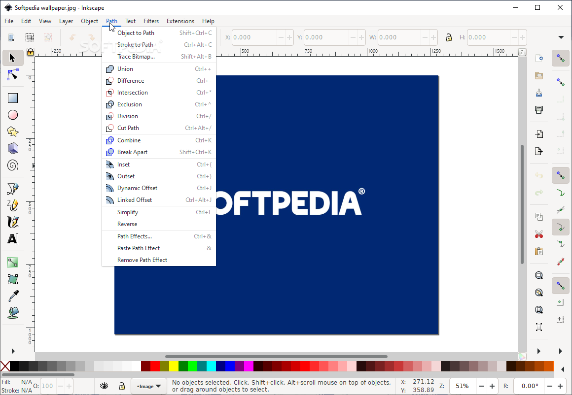
complex, it's harder to create a identifiable icon. Check inkscape,
for instance.
At the same time icons can provide a basic idea on what to expect. They
are only bad if they are not of the same style, badly designed or
incomplete. In the current situation i tried to add icons to all
relevant (mostly used) entries and it looked way better and intuitive.
In situations with a list of similar commands an icon should focus on
the difference between this commands, especially if the commands are
named in a similar way. A good example would be mask or boolean operations.
http://i1-win.softpedia-static.com/screenshots/Windows-Portable-Applications-Portable-Inkscape_7.png
What's the criterion to choose which commands have icons and which
don't? Frequency of use? For whom? Different kind of users use
different kind of tools. What's useful for me can be something rarely
used for you.
I guess we can agree that the save and export functions are important
for everyone. Thats why i would propose to give it a icon, even so on
some systems/desktops they might not be visible.
But in case of Gimps File menu we have not very well distinguishable
icons, placed in a bad way (wrong weighting) and not really good
placed items in general. I mean what has "Export..." to do with
"Create Template..." to be inside the same section, or why is "export
to" disabled if "Save" isn't?
I would recommend to give the export functionality a useful icon and
to seperate it from "Create Template", while renaming "Save" to "Save
xcf" or "Save project" and "Save as..." to "Save project as/under...".
Just keep in mind that Gnome users won't see it.
Personally, I didn't miss them when I moved to Gnome 3 (actually, I
didn't realize they were gone at first). I helped in the development
of a tangoified set of icons for inkscape and I can remember how much
work and how hard it was to come up with something reasonably good for
menus, and I'm not sure we met the goal.
Relying on icons for menus takes a lot of effort nobody seems to be
willing to make, and in my honest opinion it doesn't make a real
difference.
In that case i have to congratulate you for the useful and well
distinguishable icons. They are really good help for beginners. From my
experience beginners tend to remember icons much faster as the name of
the function itself.
Tobias Oelgarte
[
Date Prev][
Date Next] [
Thread Prev][
Thread Next]
[
Thread Index]
[
Date Index]
[
Author Index]
