Re: Task list in Gnome Shell - mockup
- From: Milan Bouchet-Valat <nalimilan club fr>
- To: Brian Fleeger <brianfleeger yahoo com>
- Cc: Gnome List <gnome-shell-list gnome org>
- Subject: Re: Task list in Gnome Shell - mockup
- Date: Sun, 03 May 2009 10:55:08 +0200
Le samedi 02 mai 2009 à 22:31 -0700, Brian Fleeger a écrit :
> From: Igor Vatavuk <jaybee444 gmail com>
> On Fri, May 1, 2009 at 7:24 PM, Sander Dijkhuis
> <sander dijkhuis gmail com> wrote:
> >>Opening the menu on mouse hover might be irritating when you
> want to
> >>reach something near the panel (like a window's title bar)
> and
> >>accidentally move the cursor to the window list button. I
> think a
> >>widget like the drop-down box in GTK+ would work well.
> >I was aiming at 1 click switch so that's why I choose hover
> >instead of click, however, I can see how this could cause problems.
>
> What about a click + hold action? With the mouse depressed, the user
> could scan through the items and release the button to select. click
> +hold and release would go very well with a touch-screen setup too.
That's actually how GTK+ menus work currently: click and hold, release
on the item you want; or just click and release, and click again on the
item you want. That's quite good, but IMHO we may need a quicker
solution to switch windows, where you don't need to go through a whole
menu.
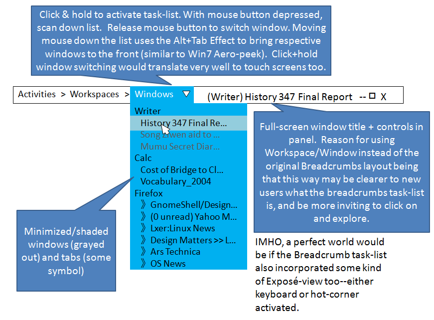
> I have been thinking a lot about these two ideas (breadcrumb +
> dropdown list), and worked up a couple of pictures. In this
> modification to Breadcrumbs, click + hold would activate the list (a
> normal single click would open and close it quickly, so the behavior
> should be easily discoverable). As the depressed mouse scans through
> the list, each time it hovers over a different title, a Mutter special
> effect similar to the Compiz Alt + Tab effect would bring that window
> in front of all the others, and darken the rest of the screen, similar
> to Win7's Aero-peek feature.
> See: http://farm4.static.flickr.com/3550/3495515137_47b1d16603_o.png
>
> In a second picture I try to work out way of scanning through
> workspaces more conveniently than a list layout. A big problem is
> that the list is linear, but the workspaces are on a grid. Even if
> workspaces had visible auto-generated numerical names, due to the
> unique pattern in which spaces are added, it would look really funky
> (not at all like a normal grid).
Workspaces should not be identified by their index, but by their
activity name. This way, you can get a readable list, and you can order
them regardless of them being in a numeric disorder (from left to right
and top to bottom). If two workspaces are for the same activity, just
say "My Activity 1", "My Activity 2".
> One solution would be to have a kind of actual drop-down grid (it may
> or may not show thumbnails of the workspaces) that comes down when you
> click the workspaces button. As with the idea above, as you mouse
> over each square in the grid, the screen itself could react by cycling
> through the worspaces, like Ctrl+Alt+arrows does now.
> See: http://farm4.static.flickr.com/3342/3495515159_c494f133fb_o.png
>
> The biggest problem I see with this layout is that a drop-down grid is
> not consistent with the regular list used for windows. But for now it
> is the only way I can think of to avoid the awkwardness of a textual
> list for workspaces.
Though you may still prefer that solution, indeed. But you need to show
the name of the activity of the workspaces in the thumbnails.
Very interesting ideas! At least for switching workspaces, it will be
efficient enough. For the windows, I'm still looking for a complementary
way...
[
Date Prev][
Date Next] [
Thread Prev][
Thread Next]
[
Thread Index]
[
Date Index]
[
Author Index]
