[Utopia] GNOME Power Manager "redesign"
- From: Richard Hughes <hughsient gmail com>
- To: Gnome Power <gnome-power-devel lists sourceforge net>, Utopia <utopia-list gnome org>
- Cc:
- Subject: [Utopia] GNOME Power Manager "redesign"
- Date: Thu, 21 Apr 2005 18:44:28 +0100
Now I know GNOME Power Manager is new, but I want your input on the
Human Interface Guideline stuff... - I've attached some screenshots of a
quick glade file DavidZ and myself have been talking about.
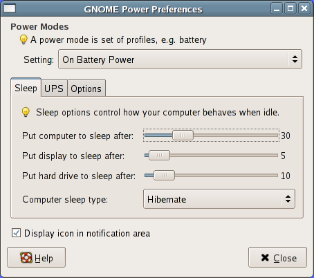
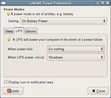
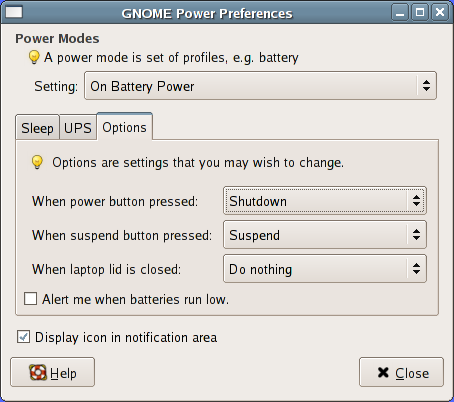
It's a redesign of the old preferences program:
http://gnome-power.sourceforge.net/gpp.php#screenshots
First of all, is this better than the old "1 icon per device, and one
tab per device type" design? - the key things the new design would
feature are:
* One notification area icon, displaying either battery status for
laptops (like the old battery icon
http://gnome-power.sourceforge.net/images/battery-all.png) or the UPS
for servers. For desktops no icon would be needed. Multiple laptop
batteries would be shown as one "virtual" battery with the charge
averaged and the time remaining added.
* A multiline tooltip when hovering over the aforementioned icon.
(DavidZ's ascii art, not mine:-)
+--------------------------------------+
| Running on [Power Adapter|Batteries] | <-+ plural only if two laptop
| | | batteries are inserted
| Laptop batteries: 42% charged | <--
| 2 hours 5 minutes remaining |
| |
| Logitech M600 mouse: 14% charged |
| |
| APC UPS: 100% charged |
| 30 minutes emergency power |
+--------------------------------------+
* The new design fits more with the "just works" idea and keeps the
system tray clutter free.
The "power modes" combobox would only display if batteries are present,
as too would the UPS tab (and lines on tooltip) with UPS hardware. The
"laptop lid" options would only show if the machine has such hardware
too.
Basically, I'm asking for feedback and comments before I start doing all
the behind the scenes work.
Thanks, Richard.
[
Date Prev][
Date Next] [
Thread Prev][
Thread Next]
[
Thread Index]
[
Date Index]
[
Author Index]
