Re: [Usability] Can't Handle it anymore! (Consistent toolbars?)
- From: Samuel Abels <newsgroups debain org>
- To: Alan Horkan <horkana maths tcd ie>
- Cc: usability gnome org
- Subject: Re: [Usability] Can't Handle it anymore! (Consistent toolbars?)
- Date: Thu, 31 Mar 2005 00:36:54 +0200
On Wed, 2005-30-03 at 23:12 +0100, Alan Horkan wrote:
> > On Wed, 2005-30-03 at 21:11 +0100, Alan Horkan wrote:
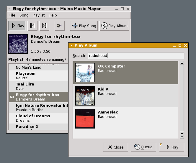
> > > > (Look at Muine (which is not my application), for an example;
> > > > http://muine.gooeylinux.org/muine.png )
> > >
> > > I assume that Muine is not still using a row of buttons rather than a
> > > toolbar as shown in the screenshot?
> >
> > As per 0.82 (latest release) Muine still has the row of buttons.
>
> I was trying to imply/ask politely if you intended to keep it that way and
> I wasn't sure it was really toolbar.
I am not the author of Muine, but this was discussed on the Muine list
quite a while ago:
http://mail.gnome.org/archives/muine-list/2004-February/msg00069.html
I have tried to clone Muine's interface into my application:
http://gnome-look.org/content/pre1/16301-1.png
(the window in the foreground)
> I would have figured a toolbar (with an application default of priority
> text) would work just as well or better (but I'm biased).
IMO Muine's current button layout
http://muine.gooeylinux.org/muine.png
looks more clean than the one pointed out in the above thread
http://brokenbits.de/lars/cruft/rb-player.png
However, if Jorn would place the current buttons into a toolbar, users
could hide the border of it using themes, and would still have it look
the same. So I can't think of a reason not to use a toolbar instead.
-Samuel
--
------------------------------------------------------
| Samuel Abels | http://www.debain.org |
| spam ad debain dod org | knipknap ad jabber dod org |
------------------------------------------------------
[
Date Prev][
Date Next] [
Thread Prev][
Thread Next]
[
Thread Index]
[
Date Index]
[
Author Index]
