
|
> From: speakwithbruce gmail com
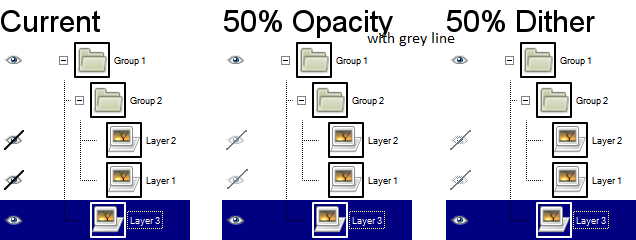
> Date: Mon, 28 May 2012 05:07:37 +1000 > To: gimp-developer-list gnome org > Subject: Re: [Gimp-developer] [enhancement] Improved layer-visibility icons > > Nice idea. >> I did some experimenting with your mock-up image.Below is an image of 50% opacity and 50% dither with a solid grey line.
> I found dithering the dash made the icon not look very much like an eye. (I didn't test out making it opaque.)
>
>I think I'm leaning more towards the 50% opacity with the line through it than the 50% dither with the line through it (simply because the > icon is clearer), but both are pretty good. A grey slash over the icon is also an improvement -- the current icon just has too much visual 'weight'. Quick experiment: apply a 3-5px blur over the current icons and which one is more easily noticed from 5 feet away? The one that indicates a hidden layer . . . but why? Perhaps it's also that long slash is long. Trimming it by a few pixels on each end can also reduce its visual weight. Attaching another mockup for brainstorming and discussion: - Right column shows what the icon would look like with the slash trimmed 3px from each end. - Second row has the slash lightened by 50%, now grey instead of black. The rest of the icon is unchanged. - Bottom row has the entire icon lightened by 50%. -- Stratadrake strata_ranger hotmail com -------------------- Numbers may not lie, but neither do they tell the whole truth. |
Attachment:
GIMP-layer-visibility-icons-#2.png
Description: PNG image