Re: [Gimp-developer] [enhancement] Improved layer-visibility icons
- From: Bruce <speakwithbruce gmail com>
- To: Gimp developer mailing list <gimp-developer-list gnome org>
- Subject: Re: [Gimp-developer] [enhancement] Improved layer-visibility icons
- Date: Mon, 28 May 2012 05:07:37 +1000
Nice idea.
I think the slash across the eye serves a purpose: it conceptually differentiates that icon from the other eye icons, indicating that those layers are part of a group.
At least for me, the eye-with-slash allows for faster recognition of that difference.
I did some experimenting with your mock-up image.
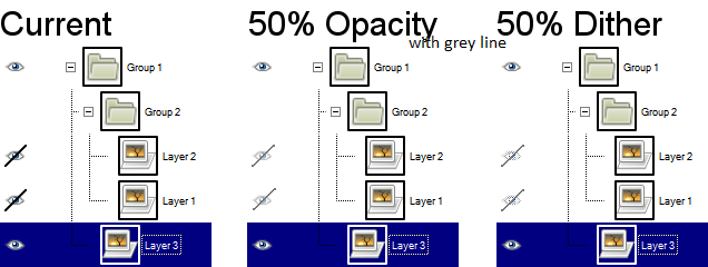
Below is an image of 50% opacity and 50% dither with a solid grey line. I found dithering the dash made the icon not look very much like an eye. (I didn't test out making it opaque.)
I think I'm leaning more towards the 50% opacity with the line through it than the 50% dither with the line through it (simply because the icon is clearer), but both are pretty good.
On Mon, May 28, 2012 at 3:12 AM, Richard Gitschlag
<strata_ranger hotmail com> wrote:
Very tempted to file this one on GNOME already, but going to check here first in case I missed something (e.g. is it configurable?) .
When you hide a layer group in GIMP 2.8, all items inside it get a new eye-with-slash icon to indicate that they are visible individually but hidden as a group.
This icon is . . . too visible. It needs to be something LESS visible than the normal eye icon.
Attached is a mockup of what some alternate icons can look like. One uses a 50% opacity, and another uses a 50% dither. (Myself, I prefer the dither look.)
Response?
-- Stratadrake
strata_ranger hotmail com--------------------
Numbers may not lie, but neither do they tell the whole truth.
_______________________________________________
gimp-developer-list mailing list
gimp-developer-list gnome org
https://mail.gnome.org/mailman/listinfo/gimp-developer-list
[
Date Prev][
Date Next] [
Thread Prev][
Thread Next]
[
Thread Index]
[
Date Index]
[
Author Index]
