
On Tue, 2022-11-01 at 08:10 +0100, Milan Crha via evolution-list wrote:
gsettings set org.gnome.evolution.shell use-header-bar false
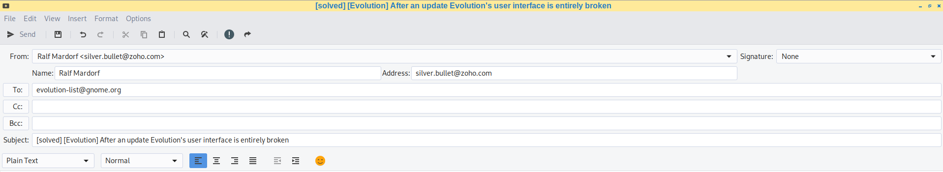
Hi,

thank you, this solved the issue, see attachments. Even the Smiley is
more friendly again ;).
Also, I would not say the interface is entirely broken. That's not fair
from you.
It was entirely broken. Btw. I can't stand to read the whole link posted
by you. This strange person mentioning "Not only do I doubt many (if
any) people..." is a liar. On almost all FLOSS related mailing lists
hundreds of people claim that they dislike exactly this ignorance and
the new design of gtk apps, that breaks with the window design of almost
all, if not all non-gtk apps and the new design gains nothing. It's not
better than the design of the non-gtk apps. The gtk design is completely
irrational from a user point of view, who is interested in getting work
done.

I'm using gtk3-nocsd, because I want that all my windows fit the same
workflow. The screenshot of Evolution without gtk3-nocsd by the link you
posted shows an Evolution windows, that would render it for my workflow
useless, too. The GTK3 windows without gtk3-nocsd, let alone gtk4
windows enforce a workflow differently from the non-gtk apps I'm using.

I explained the issue when using Evolution with gtk3-nocsd on another
mailing list:

      "Some people might claim that I'm trolling, but can those people
      explain why e.g. some icons are on the left side of the whatever
      this bar is called and other icons are on the right side of this
      bar in a really wide window. Why are the icons moved to different
      bars? Why wasn't one tool bar enough? All those icons are for
      options you need one by the other. And with all that space, why do
      they remove text? They could display the text beside the icons,
      there's enough space. What is better, if the text is only
      displayed by barely readable text if the mouse pointer does hover
      over the icon? It's not an improvement to the old user interface.
      The new user interface is against reason. Everybody can see this,
      without ever reading a scientific book related to user interface
      design.

      FWIW while writing this mail I changed Evolution > View > Switcher
      appearance from "Toolbar style/show buttons" to "Icons and
      Text/Show Buttons" and to "Text only" with "Show Buttons" disabled
      or enabled. Those options don't make a difference."

A craftsman wants tools by craftsmen for craftsmen, not tools by
inexperienced thinkers. In addition, the tools of the Foo company should
follow the same principles as the tools of the Bar company, because the
craftsman does not follow the name of the company when using them, but
the tools. If the GNOME foundation supports gtk developers to break with
the principles, then the GNOME foundation harms the craftsmen and the
tools and ultimately harms itself.

Regards,
Ralf
Attachment:
Screenshot_2022-11-01_09-13-32.png
Description: PNG image
Attachment:
Screenshot_2022-11-01_09-12-53.png
Description: PNG image