Re: Feedback needed for gnome.org homepage redesign
- From: Nuritzi Sanchez <nuritzis stanfordalumni org>
- To: Tom Tryfonidis <tomtryf gmail com>
- Cc: Allan Day <aday gnome org>, marketing-list <engagement-list gnome org>
- Subject: Re: Feedback needed for gnome.org homepage redesign
- Date: Wed, 2 Nov 2016 14:28:40 -0700
First of all, thank you so much for leading this initiative, Tom! It's much needed and from working with you on the LAS GNOME site, I can personally say that you do great work.
Secondly, I have some feedback and ideas:
Making the website for newcomers. From what I understand, the website is meant to be for people who are brand new to GNOME, and/or who may not be part of the regular community. If this assumption is true, there are some things that we should include:
- Prominent GNOME branding. I noticed you removed the GNOME wordmark from the logo. In your mockup it seems like our brand may actually be GNOME 3. We should make sure that it's clear that this is GNOME, not GNOME 3.
- Intro paragraph. To a newcomer, especially one who is not a programmer or already familiar with GNOME, it's not clear what GNOME 3 is, even after reading through it. It's too vague. I would love to help work on editing this, but need help!
Here's an initial suggestion (whipped up in 5 mins), but gives you an idea of what I mean: "GNOME 3 is a desktop user interface that comes with simple and elegant apps, and a powerful technology stack. If you’re interested in using a new operating system that gives you control while remaining simple, easy, and elegant, consider using one that ships GNOME 3. GNOME is much more than software, it’s a community of diverse international contributors who have fun while making an awesome product. We invite you to use GNOME, fall in love with it, and help us make it even better!"
.... then there can be 3 buttons below: "Discover GNOME 3" "Get GNOME 3" and "Get Involved".
Applications vs Technologies. I think changing the menu item from "Technologies" to "Applications" may be controversial and/or not correct if we maintain that page the way that it is. Do you think we should completely remove the technology page and create a new one for applications? I do like the idea of highlighting GNOME core apps and I wonder where the best place is to put it.
Donation page. What if we add this to the menu bar instead so that the home page focuses on driving 3 actions: 1) Learn more about GNOME, 2) Get GNOME, and 3) Join the community.
Latest News. The way you've laid it out makes it seem more like a blog, which may be a good way to go. What do you all think? If we want it to look like a more formal press release section, then I think keeping it the other way works well. I don't have a strong preference, but lean more towards having a formal place to announce things when needed.
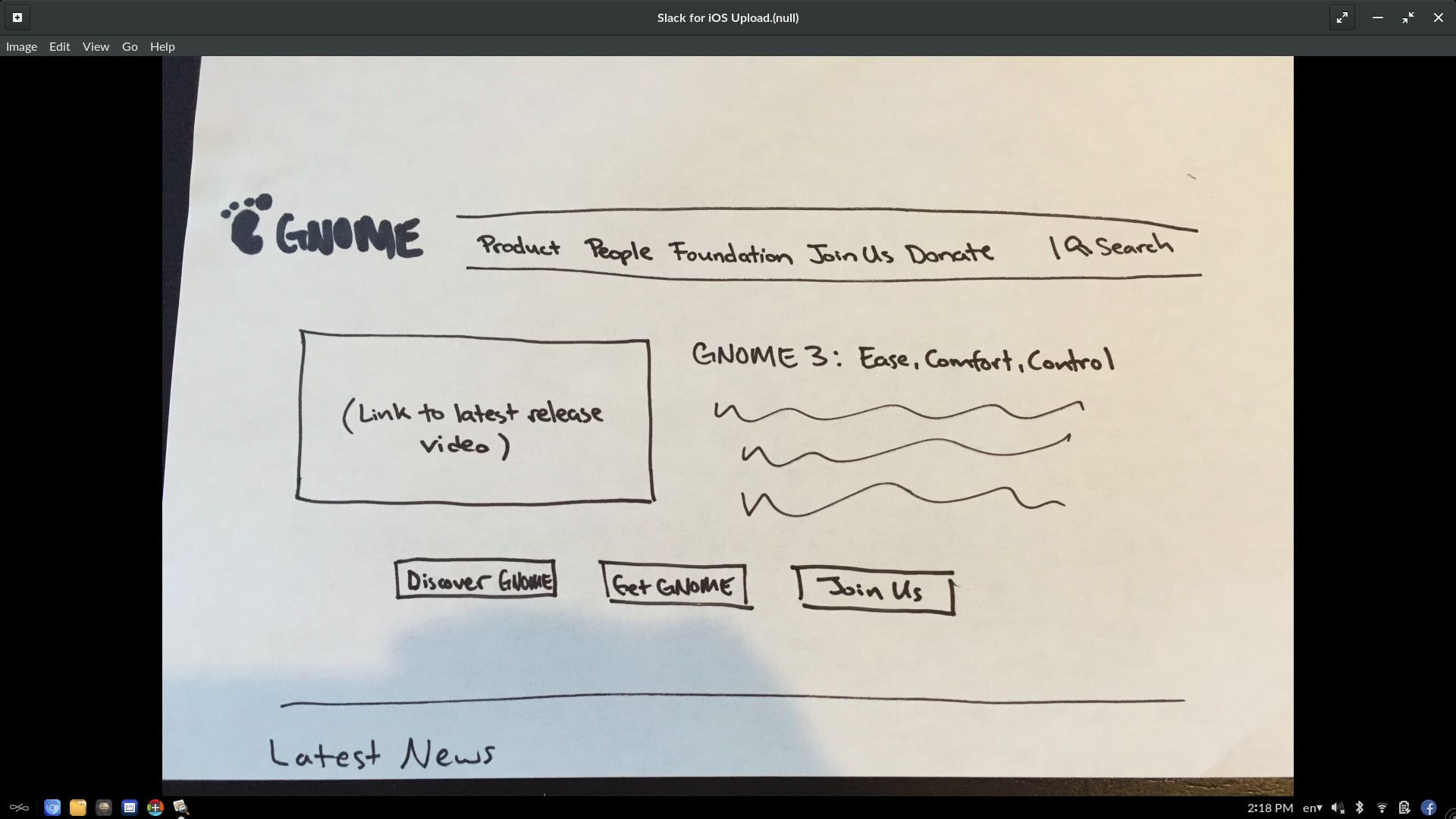
I'm attaching a
very rough wireframe of what I'm talking about above, with some suggestions for the nav too. I don't particularly love centered hero images and text, but this isn't a strong preference. Note that I've tried to condense the menu based on what our audience may need to get to quickly. We should discuss what to keep in the nav though - I'm sure it can be improved.
Regardless of the changes in my wireframe or in yours, the website remains with the same overall look and feel. Do we want that? Or do we want to make it more modern looking and have something like a full bleed image up top with just one action, or something like that?
Best,
Nuritzi
[
Date Prev][
Date Next] [
Thread Prev][
Thread Next]
[
Thread Index]
[
Date Index]
[
Author Index]