
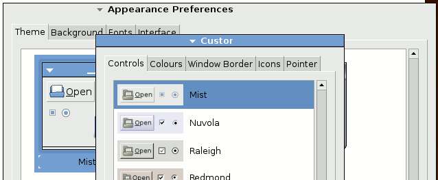
I attach a couple of partial screen shots which show some strange window
title bar behaviour observed on Debian testing which is currently mostly
GNOME 2.28, with a few bits that are still 2.26.

The first screen shot, iceweasel.png show what I saw immediately upon
this upgrade.  A couple of things are immediately obvious:

1. The button order is now completely different than previously with the
minimise button having moved to top left and the menu button to a
position part way in from the left hand side.  The close and maximise
buttons have disappeared.

2. There are two new grey areas that don't seem to do anything useful in
so far as no information is displayed in either of these areas and
clicking the mouse in them does not seem to do anything.

The second screen shot, preferences.png, show that with a different
choice of theme the distraction of the grey colour of the new blank
spaces can be avoided but it also shows the title bar of the GNOME
"customise theme" window being truncated by these two new blank areas.

Has anyone here had any input to the design of this?  If so what is
intended to go in these new blank spaces?  Is this working as intended?

Regards,
Steve.
Attachment:
iceweasel.png
Description: PNG image
Attachment:
preferences.png
Description: PNG image