[Usability] Re: [Desktop_architects] Printing dialog and GNOME (Summit mockups)
- From: Michael Sweet <mike easysw com>
- To: Alex Graveley <alex beatniksoftware com>
- Cc: usability gnome org, Carl Worth <cworth cworth org>, desktop_architects lists osdl org
- Subject: [Usability] Re: [Desktop_architects] Printing dialog and GNOME (Summit mockups)
- Date: Tue, 13 Dec 2005 15:16:11 -0500
Alex Graveley wrote:
Hi,

Carl Worth wrote:
 > PS. These side threads are entertaining, but I do hope we also get
 > back to Till's original list and we can all work together on designing
 > a good print dialog.
To this effect, here are the mockups I made at the Boston GNOME Summit
to point out some of the directions I/we were hoping to go with a GTK
print dialog.
Thanks for posting the screenshot!
This looks like a good start; some (hopefully constructive) comments:
1. "Copies" should have the "collate" check box next to it
to do collated copies. Putting the collate check box in a
separate window far away from the control it modifies is
inconsistent and confusing...
2. "Pages per sheet" option:
a. The "Pages per sheet" terminology is usually called "N-up"
among printing professionals, but I personally have no
preference and understand both terms equally well...
b. Most programs show an graphical representation (icon,
whatever) when they support N-up printing.
c. CUPS supports 1, 2, 4, 6, 9, and 16-up printing. Both CUPS
and PAPI expose this as the number-up-supported attribute,
so you can easily customize this based on the printing system
in use...
3. "Orientation" is usually shown graphically...
4. The "Settings" button opens a dialog titled "Print Settings".
I don't recall if the GNOME HIG requires them to match, but
it is nice if they do... :)
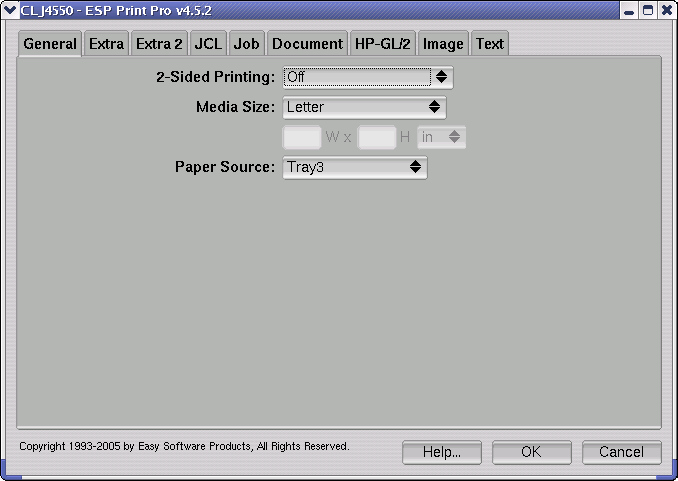
5. Print settings tabs:
a. What we've done in the past is to show a tab for
each UI group in the PPD file; see the attached image
from the current ESP Print Pro settings dialog.
However, some vendors choose to abuse UI groups and
put each option in its own group, which makes the
UI look bad... :(
b. As an alternative, I'd (optionally) add "finishing" and
"quality" tabs to the settings dialog. That is, if the
printer supports stapling, then a finishing tab is shown
which allows the user to select finishing features for
the printer. Similarly, if the printer supports quality
type options (resolution, color model, etc.), then those
options can be shown on the quality tab. Everything not
shown on the other tabs is listed under the advanced tab.
(manufacturers could set the UI group to Quality and
Finishing, respectively, to get specific options listed
in those tabs)
You can also get ideas from the Apple print dialog, but I'm not
100% in love with their design...
...
I don't think anything here precludes more advanced PPD settings, but I
think grouping the most common settings in a simpler, logical layout
makes sense.
Agreed.

--
______________________________________________________________________
Michael Sweet, Easy Software Products           mike at easysw dot com
Internet Printing and Document Software          http://www.easysw.com
[
Date Prev][
Date Next] [
Thread Prev][
Thread Next]
[
Thread Index]
[
Date Index]
[
Author Index]
