[Usability] Clickable area masks on icons with transparency?
- From: Steven Garrity <steven silverorange com>
- To: usability gnome org
- Subject: [Usability] Clickable area masks on icons with transparency?
- Date: Thu, 25 Sep 2003 00:40:12 -0300
I’m certain this issue must have been discussed before, but I’ve been
unable to find such a discussion. If this is the case, I apologize and
would appreciate a pointer to any resources or archived discussion on
the topic.
I’m a new linux user who has started with RedHat 9 coming from a
primarily Windows (3.1 through XP) background. I also have some Mac
(Classic and OS X) experience.
One of the first things I noticed about the GUI (after being pleasantly
surprised by the overall refinement) was the clickable “holes” in icons.
It seems that the visual transparency of icons also serves as tactile
transparency. You can only click on non-transparent portions of the
icon. In theory, this sound ok. If you click on a folder, it is
selected, but if you miss the edge of the folder, it is not selected. In
practice, this turns out to be confusing and annoying.
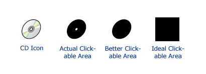
Many icons had large transparent areas with complex shapes, often
reaching right through or near the core of the opaque areas of the icon.
See this diagram of the CD icon as an example:
http://actsofvolition.com/images/gnome_icons.png
There are two separate, but related issues here. I brought this same
issue up recently regarding Mac OS X. It was pointed out to me that it
was the fault of the individual icon designer. As it turns out, the OS X
icon format separates visual transparency from the clickable area – so
an icon with lots of visual transparency can still employ the full
square shape as clickable.
Mac OS X seems to have remedied this issue in the next update (10.3) of
OS X. They now draw a selection box around the entire icon area, rather
than just the icon itself. I assume this corresponds with a completely
clickable icon are (http://macnet2.com/panther/pictures/choosingdoc.html).
So, there is the architecture of the icon format – is there separate
functionality for clickable-transparency independent from visual
transparency?
If so, I have two questions; Should this be the case? In what situation
would you want clickable area to vary from visual transparency (I can
think of some examples, but I’ll leave that aside for now). How should
individual icon designers handle this power? Should they match clickable
area to visual transparency, or should they maximize (use the full
square area) the clickable area?
If this functionality does not exist, the question remains, should
clickable area be maximized to the full area of the icon size (the full
square), or should it match the shape of the icon object?
Any pointers to research, prior art, previous discussions, or rationale
for the current implementation on this topic would be appreciated.
Thank you,
Steven Garrity
steven actsofvolition com
[
Date Prev][
Date Next] [
Thread Prev][
Thread Next]
[
Thread Index]
[
Date Index]
[
Author Index]
