Re: Chinese Traditional appearance -- mixed weights?
- From: Greg Aumann <Greg_Aumann sil org>
- To: Owen Taylor <otaylor redhat com>
- Cc: gtk-i18n-list gnome org
- Subject: Re: Chinese Traditional appearance -- mixed weights?
- Date: Fri, 29 Sep 2006 12:30:13 +0800
Owen Taylor wrote:
> It's really hard to comment on versions of GTK+ and Pango that were
> released over 3 years ago (effectively more like 4, since 2.2.0 was
> released in Dec 2002, and 2.2.4 is just a bug-fix of that); I have
> trouble even remembering what font systems were supported at that time.
>
> The screenshots show multiple fonts mixed together. If you:
>
> a) Have your text tagged with the language zh-tw
> b) Have some font on your system that fontconfig identifies as
> zh-tw ('fc-list :lang=zh-tw')
> c) Have not explicitly specified a Simplified Chinese or Japanese
> font for the text
>
> That won't happen
>
The same thing happens with Simplified Chinese in the default setup of
both older and recent versions of Gnome. For example it happens with
Gnome 2.14.2 on Gentoo and also Ubuntu Dapper.
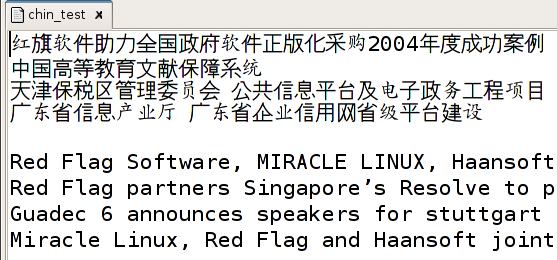
attached is a screenshot of some Chinese and English in gedit using
monospace 16pt. The same problem occurs with sans but the font mixing
doesn't occur with serif. Nor does it occur if I choose a Chinese font
but then the English often looks very ugly. As I often need to work on
documents in mixed languages just choosing a Chinese is not terribly
satisfactory. Also gnome uses monospace and serif and this problem
causes the Chinese to look really ugly and will definitely turn off some
new users of gnome.
I have always assumed that this is a problem with the default gnome
setup for fontconfig but have never found the time to actually find and
fix the problem.
[
Date Prev][
Date Next] [
Thread Prev][
Thread Next]
[
Thread Index]
[
Date Index]
[
Author Index]
