
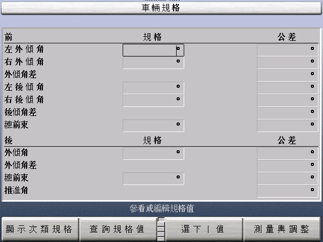
Attached is a screen shot of a screen generated using Pango with GTK 2.2.4
in Chinese Traditional.  Does the Chinese look correct?  We currently have
no one who reads Chinese, but it looks to us like we're getting mixed
weights (boldness) for different characters in the same line in many
cases.  Does it do this automatically when the selected font size doesn't
have all the characters, or is there some other problem?  The selected
language using pango_context_set_language is "zh"; the behavior is the
same using the more specific "zh-TW".  Appearance at larger font sizes or
in other languages including Chinese Simplified is much more uniform.  I
tried installing the AR PL New Sung font recommended at
http://www.unifont.org/fontguide/ and placed it ahead of all other fonts
in all the lists in my fonts.conf file and it seemed to make no
difference.  Any suggestions would be appreciated.
Attachment:
SpecsChinese.png
Description: SpecsChinese.png