
On Wed, 2011-02-09 at 18:59 -0500, Daniel P. Dougherty wrote:
On Wednesday, February 09, 2011 12:57:51 am Andreas Guelzow wrote:Consider the following (discrete) example data: 2 10 10 5 9 2 5 10 8 10 This would be really simple: 1) run the analysis 2) format the spreadsheet cells however you like 3) then create your column chart.No it turns out it isn't simple at all. The "Custom Formatting" can't be easily formatted to "Number" if the infinite bounds are used in the bins option. It all just turns to ####### or blows out the axis of the chart (both bizarre behavior)
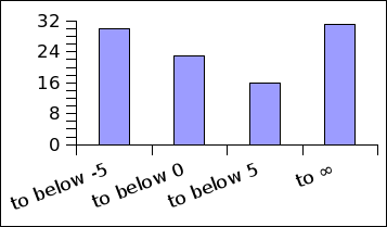
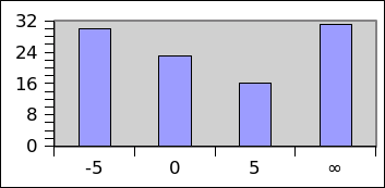
Okay if I don't touch the formatting (except rotating the labels
slightly to avoid overlap) I get something like shown in chart1.png. I
like it. Apparently you don't.

If I would prefer numbers I reformat the cells on the spreadsheet and
recreate a column chart, of course I do not use a format that requires
too much space, or if I really want I just enlarge the column width. And
I get chart2.png
 --> So OK, I then choose the one of the last two binning options which have
only the finite bounds.  Either of these options  loses all of my 2's and  10's
from my data because it doesn't capture the maximum of my data!!  My histogram
only has 80% of my data now :(
It's a spreadsheet so it is really simple to change the formula that
counts those cells you don't like. Or you can bump the limits slightly.
Histogram
              Column 1
above 2       up to 2.88888888888889                                 0.0%
above 2.88888888888889        up to 3.77777777777778  0.0%
above 3.77777777777778        up to 4.66666666666667  0.0%
above 4.66666666666667        up to 5.55555555555556  20.0%
above 5.55555555555556        up to 6.44444444444444  0.0%
above 6.44444444444444        up to 7.33333333333333  0.0%
above 7.33333333333333        up to 8.22222222222222  10.0%
above 8.22222222222222        up to 9.11111111111111  10.0%
above 9.11111111111111        up to 10                                        40.0%


So what do I need to do then?? I need to go back scan all my data (big pain if
it's a large data set or need to use functions) for max and min then set up
"Calculated cutoffs" with "Minimum cutoff" and "Maximum cutoff"  some
perturbation below my min and above max so I can get 100% of my data back into
my bins and then I go through the whole procedure again and now essentially
needing to by-pass all the new features of Gnumeric's histogram features (like
select "No chart" option and do my own Column chart setting up my own labels)
to get the most basic frequency histogram from a small data set.
Or you could just change the lower and upper values in the histogram
table...
The point one comes away with is that it is not easy at all in Gnumeric to
reproduce what is default histogram behavior of other _very_ popular software.
I think this is a problem.
Well if you can easily create the histogram you like with other very
popular software, then there is really no reason for Gnumeric to
duplicate that.

Of course If I try to look at other popular spreadsheet programs, ie.
OpenOffice3.2, Kspread, Excel, then I don't even find a histogram tool
in OOo. Searching the net for "kspread histogram" yields no result so I
suspect it may not have a histogram tool either. Excel seems to have a
histogram tool to create a histogram table but it looks to me like you
need to specify the cutoffs manually and use the chart wizard if you
want to have a chart.

Andreas
Attachment:
chart1.png
Description: PNG image
Attachment:
chart2.png
Description: PNG image