
Ok, in my version (1.10.12) the number formating only works for the Histogram
Chart type. If you select "Column chart" option you still get the "above ..."
and "up to ..." stuff but the X axis in the column chart only treats them as
words (text).
Consider the following (discrete) example data:
2
10
10
5
9
2
5
10
8
10
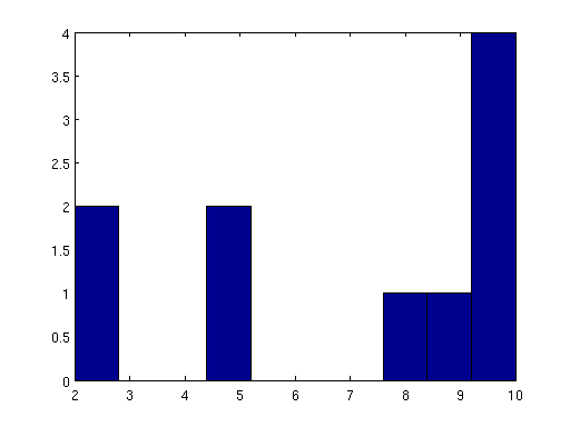
For interest of comparison with another popular software I used MATLAB's
hist() function to produce the first graphic (mlabhist.png). This is a
frequency histogram so the Y-axis shows bin count and it is apparent that no
normalization of the bin heights was done.
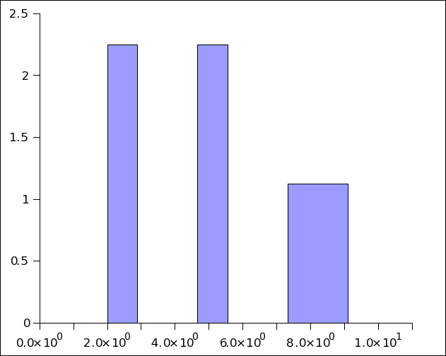
Next using Gnumeric (1.10.12) I go to Statistics->Descriptive Statistics-
Frequency Tables->Histogram and select 10 bins (default bin style) and under
Graphs & Options I select "Histogram chart".  I get the second graphic
(gnmrchist1.png).  Here the heights have been (silently) normalized.   For
comparison I did same but with "Column chart" option (see last image
gmrchist2.png) with 0% Gap between bins.  Now the Y-axis values are same as
MATLAB but the x-axis label is mal-formed text.  Here the heights were not
(silently) normalized.  So it's a different analysis result, behavior and look.

In the end, I found it difficult (to me) to reproduce the default MATLAB style
histogram and also to get nicely formated x-axis labels in Gnumeric.  The
conversion of the text labels to numbers as you had mentioned does not occur
in the Column chart type and the use of scientific notation as the default
number formatting is (apparently) not consistent across the different "Graphs &
Options" chart types.

Yes now that you have explained things, I can understand why things behave the
way they do, but I think most users (and students) will get thrown by some of
this.  My sense is that the learning curve to get in and do a quick basic
(perhaps a student's first) frequency or relative frequency histogram in
Gnumeric has just gotten a bit _higher_ in this new version and users will get
frustrated with that.

On the other side the more advanced users of Gnumeric might be pleased to see
an "Empirical PDF/CDF" option eventually appear under  Statistics->Descriptive
Statistics->Frequency Tables where the (normalized) Histogram Chart object can
be overlayed by a smoothed kernel density estimate plot.  That would be
similar to functionality one can only get now by combining MATLAB's ksdensity
and ecdfhist functions (see last image).  That would be cool!
It isn't really that hard. Just reformat the numbers to whatever you
like!
You also can't apply the number formatting tools to this text (e.g. "Scientific notation" or certain number of decimals etc)Why not? Did you try? There is no text (that's all an illusion!)
On Tuesday, February 08, 2011 04:21:16 pm Andreas J. Guelzow wrote:
On Tue, 2011-02-08 at 14:51 -0500, Daniel P. Dougherty wrote:The other issue is that the bin labels created by the Histogram process appear as english wordsnote that they only "appear as english words". They are numbers.Histogram 0.22251744455154 above 0.02077103504058 up to 0.12736215860097 8.3% above 0.12736215860097 up to 0.23395328216135 16.7% above 0.23395328216135 up to 0.34054440572173 8.3% above 0.34054440572173 up to 0.44713552928211 0.0% above 0.44713552928211 up to 0.55372665284249 0.0% above 0.55372665284249 up to 0.66031777640287 16.7% above 0.66031777640287 up to 0.76690889996325 16.7% above 0.76690889996325 up to 0.87350002352363 16.7% above 0.87350002352363 up to 0.98009114708401 8.3% All of the "above..." in one column and "up to ..." in the next column over makes it difficult to make decent X-axis labels for "Column chart" (see attached image).It isn't really that hard. Just reformat the numbers to whatever you like!You also can't apply the number formatting tools to this text (e.g. "Scientific notation" or certain number of decimals etc)Why not? Did you try? There is no text (that's all an illusion!)This really needs to be fixed some how.there is nothing broken here, I think .Possible solution might be to label the bin center?? Possibly at a third column with the bin center so the user (at their option) can use the bin center as a label??It is easy enough to add a column after the fact for that purpose. Remember this is a spreadsheet.My sense is that the current labeling scheme for histogram will seem at odds with what a typical end-user would/will expect/want.I don't see how. Since these are numbers you can always format them as you like. Andreas
--
-----
Daniel P. Dougherty
W27 Holmes Hall
Michigan State University
East Lansing, MI 48827
Email: doughe57 msu edu
WWW: http://www.msu.edu/~doughe57
Attachment:
mlabhist.png
Description: PNG image
Attachment:
gnmrchist1.png
Description: PNG image
Attachment:
gnmrchist2.png
Description: PNG image
Attachment:
mlabepdfhist.png
Description: PNG image