[Evolution-hackers] Re: Selecting/Unselecting Sources
- From: Tuomas Kuosmanen <tigert ximian com>
- To: Rodrigo Moya <rodrigo ximian com>
- Cc: JP Rosevear <jpr ximian com>, Evolution Hackers Mailing List <evolution-hackers ximian com>, hpj <hpj ximian com>, Chris Toshok <toshok ximian com>
- Subject: [Evolution-hackers] Re: Selecting/Unselecting Sources
- Date: Mon, 19 Jan 2004 16:00:40 +0200
On Mon, 2004-01-19 at 11:21, Rodrigo Moya wrote:
On Sun, 2004-01-18 at 22:10 -0500, JP Rosevear wrote:
> Basically the UI for showing/hiding calendar sources and selecting a
> primary source sucks pretty bad.  It allows inconsistencies in the UI.
> I've been playing around with this a bit and keep coming up with two
> issues:
>
> 1. Does it make sense to allow a "primary" calendar (the one
> highlighted) to not be checked (shown in the view to the right).  What
> does Apple's Ical do?
>
hmm, good question, since that primary calendar will be used as the
default for a lot of operations, while not being selected, which could
make the user think her new appointment wasn't saved, since it wont show
up in the calendar views.
I think this makes sense. I'll check what ical does in a moment, but I think it is good that there is always at least one calendar visible. I mean, it is possible that it is the only calendar even, so hiding it is kind of silly.
I also think it would be good that whenever someone selects (hilights) a calendar, the other calendars get "faded out" - the events would still be visible, but they would all be washed out, gray and lower contrast - so you mostly can tell if a given time is "free or busy" - and your hilighted calendar has its events drawn in the calendar color.
In a nutshell:
-> Calendar is hilighted, its label becomes bold on the list
-> On the month pane, if a given day has an event in the hilighted
calendar, the day number is bolded. "Un-bold" the other
calendars' events when one is hilighted. Easy to see an overview
of a calendar that way.
-> On the day/week/month/etc view:
-> Hilighted calendar's event titles also become bold
in the view
-> Other calendars that are not hidden get "grayed out" -
drawn in light, washed out gray so that they do not
stand out in the view, but rather just serve as a
"free and busy" indicator.
The explanation sucks a bit, I'll try to mockup soon. The basic idea is, that when you hilight a calendar on the list, it also gets "hilighted" on the actual calendar view: other calendars are "dimmed" in the background so one can focus on the selected one.
When one "unhilights" the calendar (clicks on the empty space on the list?) the view returns to normal with each calendar having its own color etc.
Multiple selection should also be possible in the same way - just "dim" the unselected calendars.
> 2. When checking/unchecking a calendar, should you be forced to select
> the row you are toggling?
>
I think not, if possible at all.
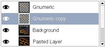
I agree. This somehow reminds me of the Gimp/Photoshop layer list widget where there is the layer name and an eye icon. Clicking the eye icon toggles the visible state of the layer, without selecting the layer itself. It's a two-column list, maybe that could be done so that clicking the name column selects the calendar and clicking the "checkbox" column shows/hides the calendar..? Then the main calendar would simply not have a checkbox at all or something.
Sorry for the HTML mail, but I wanted to include this inline image as an example:

|
|
Fig1: Gimp's Layer List
|
|
Maybe this could work for the calendar too? And it could indeed work for all the components that can have a "mixed view" of all data sources.
Tuomas
--
Tuomas Kuosmanen :: Art Director, Ximian :: <tigert ximian com>
|
[
Date Prev][
Date Next] [
Thread Prev][
Thread Next]
[
Thread Index]
[
Date Index]
[
Author Index]