System Monitor Graph Style Suggestions
- From: Steven Garrity <stevelist silverorange com>
- To: desktop-devel-list gnome org
- Subject: System Monitor Graph Style Suggestions
- Date: Tue, 14 Feb 2006 20:54:19 -0400
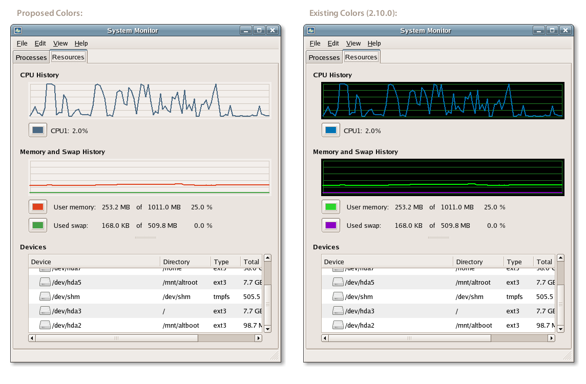
Taking a quick look at the Gnome System Monitor today, it occurred to me
that the graphs have a distinct EGA-graphics-circa-1986 visual feel to
them. These graphs are ripe for some Tufte-fication [1].
Here's a quick mockup of the dialog with some suggested color (and only
color) changes:
http://actsofvolition.com/images/screenshots/gnome/system-monitor-mockup.png
In the hopes of keeping potential implementation simple, I have only
changed is the background color, grid color, and changed the default
user-configurable colors to some I picked quickly from the HIG [2]. Of
course, smoother lines would be nice too...
Apologies if this isn't the appropriate list. I'd be glad to work with
the current system-monitor maintainer if there is any interest in
implementing these changes.
Thanks,
Steven Garrity

[1] http://en.wikipedia.org/wiki/Edward_Tufte
[2] http://developer.gnome.org/projects/gup/hig/2.0/design.html#design-color
[
Date Prev][
Date Next] [
Thread Prev][
Thread Next]
[
Thread Index]
[
Date Index]
[
Author Index]
