Re: System Monitor Graph Style Suggestions
- From: David Malcolm <dmalcolm redhat com>
- To: Steven Garrity <stevelist silverorange com>
- Cc: desktop-devel-list gnome org
- Subject: Re: System Monitor Graph Style Suggestions
- Date: Tue, 14 Feb 2006 20:24:39 -0500
On Tue, 2006-02-14 at 20:54 -0400, Steven Garrity wrote:
> Taking a quick look at the Gnome System Monitor today, it occurred to me
> that the graphs have a distinct EGA-graphics-circa-1986 visual feel to
> them. These graphs are ripe for some Tufte-fication [1].
>
On the subject of Tufte and gnome-system-monitor, I've implemented a
GtkCellRenderer subclass for sparklines and implemented it for the
per-process CPU usage:
http://bugzilla.gnome.org/show_bug.cgi?id=319682
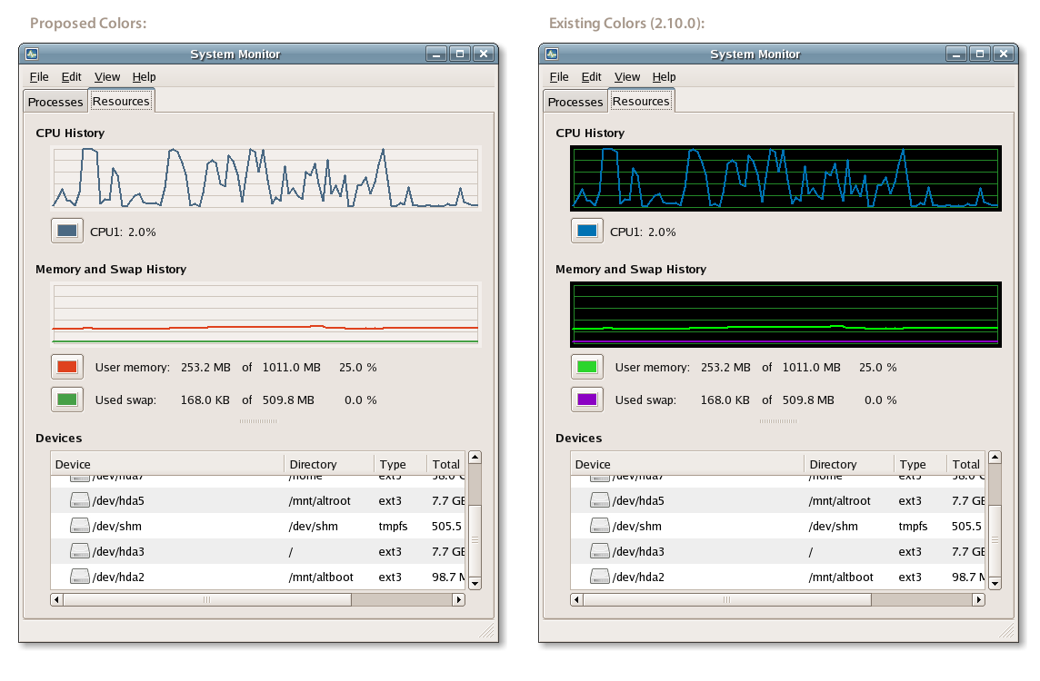
> Here's a quick mockup of the dialog with some suggested color (and only
> color) changes:
>
> http://actsofvolition.com/images/screenshots/gnome/system-monitor-mockup.png
>
> In the hopes of keeping potential implementation simple, I have only
> changed is the background color, grid color, and changed the default
> user-configurable colors to some I picked quickly from the HIG [2]. Of
> course, smoother lines would be nice too...
Going slightly beyond the above, both X and Y axis ought to be labelled,
probably with a simple 100% at the top of the Y axis, and perhaps
minutes on the axis axis. (an unlabelled axis is one of Tufte's peeves)
Going much beyond, who is the intended user of gnome-system-monitor, and
what is its purpose? Is it simply a GTK replacement for "top", or is it
intended to show something that's meaningful to:
- end-users?
- sysadmins?
- software developers?
(I don't think that "top" is particularly good for any of the above)
My primary use of sparklines is when I'm wondering why my CPU spiked 10
seconds ago and I only just got control back over the UI (by which time
the constantly shifting CPU stats aren't helpful - what if the process
isn't around anymore?)
[snip]
Hope this helps
Dave
[
Date Prev][
Date Next] [
Thread Prev][
Thread Next]
[
Thread Index]
[
Date Index]
[
Author Index]
