
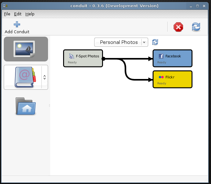
Funny you should post that, I have a mockup that's been sitting in my
home directory for a while now waiting for some polish but I think
I'll just post it 'as is'. There are bits that I'm not happy with at
the moment but the general ideas are there. What do people think?

My main aims were:

1. add a big 'sync' button to avoid having to right click on the
applet (also add a cancel button on the toolbar)
2. make the data providers more 'manageable' (not sure that's what i mean)

Right now the tree view isn't too much of a problem but presumably
over time more and more providers will be there, making it more
confusing and longer.

In my proposed solution you have an "Add Conduit" button from which
you can choose a data type, photos for example, this adds an icon to
the left panel which then features a drop down to select relevant
providers.

Clicking an icon in the left panel filters the view, you can then
further divide data types into custom groups (e.g. personal
photos/work photos) using a drop down at the top of each group (i
don't really like this, i think it is over complicating things) you
can also sync the current group only.

Regards,
Kris.


2008/7/16 Andrew Stormont <andyjstormont googlemail com>:
> Pls, tell me what you think.
>
> You'll probably have to view it in inkscape, since I have no idea how to
> add an opaque background :p
>
> Andy Stormont.
>
> _______________________________________________
> Conduit-list mailing list
> Conduit-list gnome org
> http://mail.gnome.org/mailman/listinfo/conduit-list
>
>
Attachment:
conduit.png
Description: PNG image