
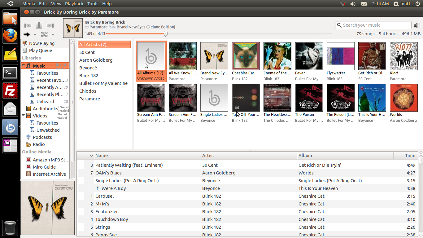
This email has banshee-mockup-6-music_browser.png attached, Mockup 6
showing the music browser in PNG format.

On 5 January 2011 09:18, Matt Sturgeon <mttza1 gmail com> wrote:
> Right - I've been having issues with reciving my Gmail account, but I
> have redesigned the mockups into a 6th which has two versions, one
> showing the Browser (music collection) and another on the Now Playing.
>
> Hopefully i will at some point get arround to uploading them to the
> banshe mockup page (http://www.kicks.co.cc/banshee-mockup/) but I will
> follow-up this email with them attached.
>
> Comments, as always welcome.
>
> On 16 December 2010 21:13, Michael Martin-Smucker <mlmartin13 gmail com> wrote:
>>
>> On Thu, Dec 16, 2010 at 3:33 PM, IBBoard <ibboard gmail com> wrote:
>>>
>>>  c) are we really gaining anything more than a few pixels, or are we
>>> basically removing the status bar only to pad out the top bar?
>>>
>>
>> This is my biggest concern with this proposed toolbar revamp.
>> Several posts ago, Bertrand asked what problem this is trying to solve, and
>> I don't think I've seen a complete answer to that question yet.  Is the goal
>> of this change to save vertical space?  If we eliminate the status bar and
>> keep the toolbar at its current height, we might free up enough vertical
>> space to show one extra song in the library.  That isn't, in my opinion,
>> enough of an advantage to justify adding clutter to the toolbar.
>> Also, from a consistency point of view, I don't think that the track count /
>> total length / file size information belongs in the top toolbar.  Nautilus,
>> Rhythmbox, Windows Explorer, Mac Finder, and iTunes all show this kind of
>> information in the status bar, and I don't see any reason for Banshee to go
>> against that convention.  Adding that much text to the top toolbar makes
>> that corner feel cluttered, and I'm afraid that it would be even more so
>> with the search box there.
>> In my opinion, gtk-based music players are all a bit bland in the toolbar
>> area, so I'm excited that you and others are exploring the possibilities.
>> I'm just not sure I agree with the idea of merging the toolbar and status
>> bar, and I'd be interested in hearing how individual changes that you're
>> proposing are an improvement on the current Banshee interface.
>> Michael
>> _______________________________________________
>> banshee-list mailing list
>> banshee-list gnome org
>> http://mail.gnome.org/mailman/listinfo/banshee-list  (unsubscribe here)
>>
>
Attachment:
banshee-mockup-6-music_browser.png
Description: PNG image