Re: [Usability] Tab implementation review
- From: Mikus Grinbergs <mikus bga com>
- To: usability gnome org
- Subject: Re: [Usability] Tab implementation review
- Date: Wed, 15 Jul 2009 14:39:42 -0400
"What if you want three levels" of organization (tabs, windows,
workspaces)? Well, I tend to think that having more levels complicates
the mental model and also requires more time for habituation.
As for the solution given by Steve (using virtual desktops as the top
hierarchical level, and window lists to retrieve open documents) it
has a severe drawback with respect to tabs, which is that of
visibility.

I never use virtual desktops because, for me, a window in another
workspace is "lost". I rely on the persistent visual cues of open
windows to remind me of ongoing tasks. Tabs enhance this for
particular documents; it allows me to juxtapose the tab list in
several windows at once, giving me the chance to quickly find where a
recent document is placed and to which task it does belong. All this
is lost with a single unified list of everything, or with tasks
distributed among several desktops.
To this day I use OS/2 as the primary platform on which to do my
computer work. More than ten years ago there was available for OS/2
a commercial product ('Object Desktop'), among whose many features
is a 'Tab Launch Pad'. The three-level hierarchy that I've set up
on my system with the functions provided by Object Desktop has
served me excellently all this time, and is a significant reason why
I'm still using OS/2.
Large monitors were too expensive for me in the 90's, so I've gotten
habituated to not having more than two "working with" windows on my
screen at any one time. If I am accessing more windows than that, I
place the additional windows on additional virtual desktops (another
feature of 'Object Desktop'). And that led naturally to me using
virtual desktops as the top level of my computer_work hierarchy --
once booted, my OS/2 system is set up to present me with a selection
of "permanently" defined functional desktops (for communications,
for development, for doing correspondence, for multimedia, for data
access, for doing writing, etc., etc.).
1st level selection - Object Desktop provides a 'Control Center'
showing in miniature (graphically) an image of each of my virtual
desktops. I select the work I am interested in by clicking within
the representation of a particular desktop -- causing that desktop
to occupy my screen. Focus is given to the window (in that desktop)
on whose miniature I chose to click on.
[ This is how I can conveniently limit the number of "working with"
windows on my screen at any one time. On a screen occupied by many
overlapping windows, the user typically moves the cursor to what he
can see of the window he wants next, then clicks to bring the focus
to that window. In my case if the window I want next is not on the
same desktop, I move the cursor (it's a slightly longer distance to
move) to what I can see of the miniature of the window I want, then
click to bring the focus to that window. Same set of actions. (The
'Control Center' lets me move a window between virtual desktops by
dragging the miniature of the window onto the representation of the
desired desktop.) ]
I am concerned with the amount of "real estate" used on screen by
"system overhead" items. Accordingly, my screen defaults to having
ONLY three items on it: (1) A (persistent) icon for the OS/2 system
itself, which serves as the starting point in case something has
gone wrong, and I have to "resuscitate" my desktop; (2) the
(persistent) 'Control Center' on the lower left, which lets me do
1st level selection; (3) a dynamic 'Tab Launch Pad' position on the
lower right, to let me do 2nd and 3rd level selection. I populate
each virtual desktop with its __own__ unique 'Tab Launch Pad' - as I
switch virtual desktops the previously shown 'Tab Launch Pad' gets
overlain by the new one - thus only launch facilities pertinent to
the current desktop function need to take up room on the screen.
The Object Desktop 'Tab Launch Pad' is conceptually organized into
an upper and a lower part. In my case I put "tabs" into the lower
part, where they are visually less prominent. (I put "object
buttons" on the upper part, to give them more prominence.)
[Subsequent descriptions of the 'Tab Launch Pad' will refer to my
specific setup.]
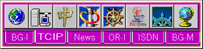
2nd level selection - One can define as many "tabs" in each 'Tab
Launch Pad' as one wants. "Tabs" are arranged in a single row in
the bottom part of the 'Tab Launch Pad' window. If there are more
tabs than can fit, additional rows will be used. Clicking on a
"tab" will cause the upper part of the 'Tab Launch Pad' window to
display a single row of launch objects (ones with which *that* tab
got populated).
3rd level selection - the set of launch objects ("buttons") for the
selected tab is displayed as a single row in the top part of the
'Tab Launch Pad' window. The corresponding object is launched by
clicking on its "button". "Buttons" are added to the set of launch
objects shown by the currently selected "tab" by dragging them into
the row being shown. If there are more buttons than can fit,
horizontal scrolling for that row is provided.
[Note that I am a procedure-oriented person, rather than an
object-oriented person. Therefore my own selection of third-level
objects is of "applications", and my criterion was "access while
using a minimal amount of screen real estate". But there is no
barrier to someone else using a 'Tab Launch Pad' concept to access
third-level objects which are "documents", etc..]
To summarize my three-level hierarchical selection -- [if new
function] click on virtual desktop representation; [if new
category] click on tab (in displayed desktop); [to launch] click on
button (icon) (in row displayed by tab).
mikus
[
Date Prev][
Date Next] [
Thread Prev][
Thread Next]
[
Thread Index]
[
Date Index]
[
Author Index]
