Re: [Usability] cheese usability review
- From: Calum Benson <Calum Benson Sun COM>
- To: "daniel g. siegel" <dgsiegel gmail com>
- Cc: "usability gnome org" <usability gnome org>
- Subject: Re: [Usability] cheese usability review
- Date: Tue, 29 Jan 2008 13:37:25 +0000
On 4 Jan 2008, at 21:30, daniel g. siegel wrote:
dear all,

while the ui of cheese gets described as quite good by some and as
pretty bad by others, i would like to discuss the ui and usability of
cheese and even enhance it to be full HIG compatible. i am not a
usability expert and the ui of cheese was done step by step without
even
thinking about people with handicaps or other usability features.
therefore it would be very nice if some of you could post their
opinion
about cheese and what we could do better.
I'm looking at v2.21.5 here. Unfortunately I don't have a camera I
can attach, so I'm making some guesses about what the 'real'
experience would be, and possibly missing out some important stuff.
Initial impressions:
- It looks weird to have the buttons in the 'middle' of the window,
with (initially) a big empty white area at the bottom-- it looked like
the window hadn't drawn properly. (I know Photo Booth does this too,
but it uses clever shading to make the photo bin look like a 'tray'--
not something I'd recommend you do, unless you can make it work in a
theme-compliant way.) I'd suggest either moving the buttons to the
bottom of the window, below the photo bin, or putting the photos in a
sidebar rather than along the bottom.
- Scrollbars: if keeping the photo bin rather than moving it to a
sidebar, you shouldn't show the horizontal scrollbar unless it's
actually required.
- I don't think this application needs a menu bar. Main application
windows should generally have either a menu bar or dialog-style
buttons, but not both. And you can already do everything except open
the online help without the menu bar. (You could add another button
for Help, on the far left-- same placement as dialogs.)
- Since the 'affirmative' button is "Take a Photo" (or "Start
Recording"), this should probably be the button furthest to the
right. Also, its label shouldn't be in bold text.
- Photos: I should be able to multiple-select existing photos using
the standard keyboard and mouse shortcuts, and perform the same
actions on the selection as I can on a single photo.
- Opening photos: Perhaps an "Open With" menu item would be more
useful than just "Open"?
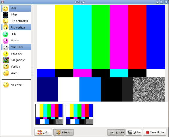
- Effects: IMHO it would be better if these were presented in a
sidebar or a floating palette, which could be shown or hidden by
clicking the button. That way I could see a live preview as I was
selecting my effects. You'd probably want to make the preview icons
much smaller if you did this, so you could see the full list without
having to make the window much larger.
- Taking a photo: I'm guessing the red background and white font
colours in the countdown are hard coded, rather than taken from the
current gtk theme? IIRC gtk now supports extra theme colours like
'critical' and 'warning'... so I'm guessing you should maybe be using
something like the 'critical' colour for the background here, with a
contrasting theme colour for the font.
- Countdown: the font and font size also seem to be hard coded; again,
they should both be taken from the theme.
- Move to Trash: no confirmation alert is required for this action;
it's easy enough to "undo" (by manually recovering the photos from the
trash).
Accessibility: main concerns here are the colours and fonts that
aren't taken from the theme (as I mentioned already), and the non-
standard way of showing focus on the photo thumbnails and selected
effects. If you move the effects to a sidebar you could just use a
standard list control, so you'd get the focus effect for free. For
the photos, it would be better to draw a focus indicator around the
photo rather than tinting it-- the gtk theme provides you with the
required thickness and colour of focus indicators. Ideally, the
effect icons should all be themeable as well, although I wouldn't
expect many themes to override them.
Very quick mockup attached of what all this might look like (have put
the effects in a sidebar rather than a palette, for the sake of
argument...)
Cheeri,
Calum.

--
CALUM BENSON, Usability Engineer       Sun Microsystems Ireland
mailto:calum benson sun com            GNOME Desktop Team
http://blogs.sun.com/calum             +353 1 819 9771

Any opinions are personal and not necessarily those of Sun Microsystems
[
Date Prev][
Date Next] [
Thread Prev][
Thread Next]
[
Thread Index]
[
Date Index]
[
Author Index]