Re: [Usability] colon ':' in text field label
- From: Shaun McCance <shaunm gnome org>
- To: Liam R E Quin <liam holoweb net>
- Cc: usability gnome org
- Subject: Re: [Usability] colon ':' in text field label
- Date: Tue, 12 Aug 2008 10:04:09 -0500
On Fri, 2008-08-08 at 12:45 -0400, Liam R E Quin wrote:
> On Fri, 2008-08-08 at 15:04 +0200, Luca Bruno wrote:
> [...]
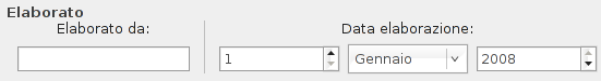
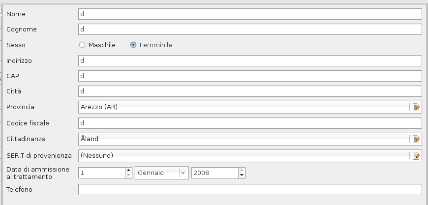
> > These are some screenshots of my latest application:
> > http://farm3.static.flickr.com/2384/2743364149_3258418491_o.png
> > http://farm4.static.flickr.com/3167/2743368623_842a83468c_o.png
> >
> > What do you think about? Are colons really a need?
>
> Thinking froma graphical design perspective, your 2nd example has
> a problem in common with a lot of GNOME applications - there is
> a weak vertical centreal axis created by the two columns, and
> the items in two columns are more closely connected with each
> other than with rows. Try the "squint test" - half-close your
> eyes so you can't read it - and you'll see what I mean. It's
> especially strong as the words aren't in a language I can read,
> of course.
>
> The usual fix for this would be to right-align the labels, and
> then the colon would both strengthen the vertical axis annd help
> people make the connection in rows. But I think the HIG
> unfortunately favours left-adusted labels, and in that case the
> colon is even more important to show the reader that the
> things way way way over to the left are actually labels.
Actually, the HIG contains this very unfortunate recommendation:
Left-align components and labels, unless all the labels in a
group have very different lengths. If they do, right-align the
labels instead, to ensure that no controls end up too far away
from their corresponding labels.
This is very internationalization-unfriendly advice, since labels
might be wildly different lengths in different languages, yet the
alignment will be set based solely on the lengths in English.
--
Shaun
[
Date Prev][
Date Next] [
Thread Prev][
Thread Next]
[
Thread Index]
[
Date Index]
[
Author Index]
