Re: [Rhythmbox-devel] New mockup, new thread
- From: Kristian Harms <kr-harms online no>
- To: rhythmbox-devel gnome org
- Subject: Re: [Rhythmbox-devel] New mockup, new thread
- Date: Sat, 10 May 2003 21:50:47 +0200
Daniel Borgmann wrote:
>
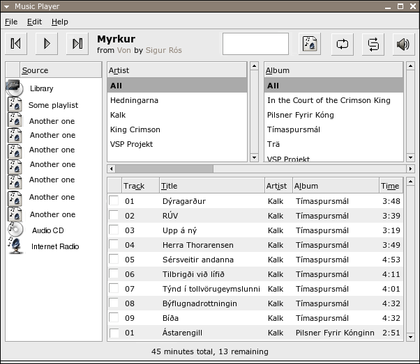
> The last hours I tried to get a bit used to Glade and I think I rather
> got the hang of it now. :) This is my current favorite:
> http://server204.serverflex.de/Screenshots/rhythmbox2.png
> Can it be any simpler, does it have to be more complicated?
>
> Everything is layed out very cleanly and easy on the eyes. But that's
> just my opinion, I hope you consider it.
I'll just delurk (joined the list a few days ago) to say that that
screenshot is the best i've seen so far in terms of over-all layout, and
to add some additional comments:
The statusbar at the bottom should be simpler, without the decorative
border. This'll save valuable pixels vertically. Love the checkboxes.
One could also have a checkbox for turning the browser on and off.
I love the way the special button is given prominence and a caption in
that screenshot. Many users would never realize what the special button
is without such a caption.
The box/border around the middle "area" in the toolbar area seems
awkward and not very gnomish, as others have said, but removing it leads
to other problems. So what to do? In iTunes, Apple have made this area
seemingly without using the native widgets, opting instead for a kind of
ad hoc solution resembling the display of a physical music device, with
a greyish background. This way, they avoid the awkward border in the
screenshot above, and they also avoid the "visual need" to have the
volume slider and the position-in-track thingy be vertically aligned to
each other, and they avoid confusing users as to the differences between
the two sliders. Rhythmbox could be similar, using a white rectangle
instead of a rounded grey area as in iTunes. The "position in track"
widget would need to look entirely different from the volume slider,
though that might be difficult to code since it would be an ad hoc
widget and not something from GTK (i might be wrong).
The white rectangle would be like the one in the following screenshot,
but centred, larger and containing the "$Trackname from $Album by
$Artist" text together with the "position in track" widget and some
numbers giving elapsed time of the playing track. The screenshot:
http://xsu.sourceforge.net/search4.png
--
Kristian Harms
[
Date Prev][
Date Next] [
Thread Prev][
Thread Next]
[
Thread Index]
[
Date Index]
[
Author Index]
