
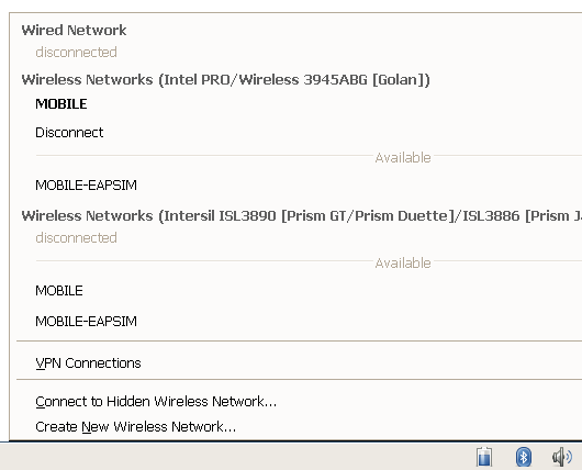
Dear All,I've used NM a bit with a machine which has multiple network cards, and I thought I'd attach the following screenshot. I think that the layout is rather confusing, and perhaps could be improved.
I think it's confusing because the horizontal rules appear to take visual precedence over the slightly less-indented headings. Thus it seems to be divided into 5 sections:
1. Wired Network,Disconnected, Wireless Networks (IntelPro), Mobile, Disconnect
<hr>

2. Mobile-Eapsim, Wireless Networks (Intersil), disconnected.

<hr>

3. Mobile, Mobile EAPSIM

<hr>

4. VPN connections

<hr>

5. Connect to Hidden, Connect to New
If there is only one WiFi card, it's far less confusing. However the screenshot attached could, imho, be much improved by a better layout.
Best wishes,

Richard
P.S. I seem not to be thinking very clearly - I was going to add this comment as a post-script to my previous message; it then occurred to me that it would be clearer in a separate thread, but added the (irrelevant) attachment to the last message too - sorry for the confusion!
Attachment:
snapshot1.png
Description: PNG image