Re: [gtk-list] Re: check button MS-Windows style.
- From: leon udmnet ru
- To: gtk-list redhat com
- Subject: Re: [gtk-list] Re: check button MS-Windows style.
- Date: Wed, 22 Dec 1999 00:41:29 +0400
David Given wrote:
> >Something like this:
> >
> >Unchecked Checked
> > +-----+ +-----+
> > | | |\ /|
> > | | | \ / |
> > | | | X |
> > | | | / \ |
> > | | |/ \|
> > +-----+ +-----+
>
> These aren't particularly good. Does the X mean that it's crossed out, or what?
>
> If you want unambiguous (and looking pretty good, too), take a leaf out of
> XView's book. That used an empty square for off, and a square with a tick in
> it for on.
>
> (XView was in fact a very nice-looking widget set, and way before its time. Is
> there an XView-lookalike Gtk theme?)
Seems there gonna be a holy war on check button look :)
Seriously, here is a couple of thoughts on how look-and-feel
can be designed. First of all, there must be consistency.
This means that if some shapes have rounded corners (e.g.
buttons in Mac OS), then we have a particular artistic style.
Rounded-corner button suggest smoothness, even something
biomorphic. That means that other shapes should be more
'human-like', namely, check button mark should resemble the
mark a human makes with the pen on paper.
Gtk doesn't have smooth shapes. On the contrary, all of
the gtk is rectangles. So I can define the spirit of Gtk
as a kind of 'industrial' design. Maybe it's some kind of
'constructivism'. I'm writing this letter in Netscape under
WindowMaker WV. It has an idea of gtk look, it has gtk
theme among it's other themes. Gtk theme in WindowMaker is:
solid-fill menu items (light gray color), solid filled window
title bar in blue. This is particularly unusual, as soon as
WindowMaker's themes are all gradient fill, not solid fill.
(BTW, this suggest a complementary color to traditional Gtk
gray).
So. What we see isn't very human-friendly shapes, but
through consistency we can do a magic trick. (Remember, that
a lot of computer users are used to Windows, and it's a
dumbed-down version of human-friendly Mac, so that 'technical'
design will not be an eyesore to an average user, because
s/he is already accustomed to dry and sharp shapes.)
Consistency can work wonders. As I mentioned earlier, ugly
Motif becomes beautiful through consistensy :) What you have
to do to implement consistency is to feel the spirit first,
and then to extend the theme in that spirit :)
That's everything what can be argumented. What's farther is
more or less speculation. For example, you can have a look
at modified gtk widget's appearance in the attachment. You
can notice that I introduced one more type of line: thin
relief line. If you like it, I can do something more :)
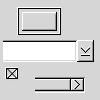
>From top to bottom are: default button, a fragment of
combo box, check box, fragment of a scroll bar.
Leon.
--
IBM Pollyanna Principle: Machines should work. People should think.
[
Date Prev][
Date Next] [
Thread Prev][
Thread Next]
[
Thread Index]
[
Date Index]
[
Author Index]
