
For usability reasons, I want the selected window (title bar) to be of a different color, so that I can see what window that has focus. Maybe it could fade into another color, or fade into dark grey (while the text fades into white or light grey), perhaps?
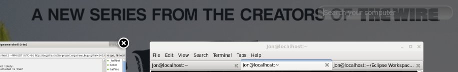
The search component in the activities area almost look invisible, see my attachment. Sure, I have some text in the background, but still...
Also, I think the window shadows might be just a tiny bit too heavy.

About the icon size:

On 11/30/2010 08:42 AM, Marco Piazza wrote:
I tried it but i find out the new dash has too little icons.
I agree with this. You cannot even see what some of them are supposed to represent. I liked the size in the previous version.
On 11/30/2010 02:34 PM, Cyril Arnaud wrote:
I think the size of the previous version should be the standard one and that the Large Text option should make it even bigger. I'm on a 1400x1050 display.I personally think that icon size is perfect as is.If some people needs bigger icons, then the icon size should be increased through the Universal Access (Large Text option maybe).
Jon
Attachment:
search.jpg
Description: JPEG image