Re: a couple of words from a former KDE user
- From: "Ravi Kumar" <ra21vi gmail com>
- To: gnome-list gnome org
- Subject: Re: a couple of words from a former KDE user
- Date: Tue, 6 Mar 2007 14:58:34 +0530
On 3/5/07, andrei raevsky <raevsky andrei gmail com> wrote:
Hi guys,
For years I used to have KDE on all my machines and I was very happy with it. Then I switched most of my machines to gNewSense (website: www.gnewsense.org/ , review:
http://distrowatch.gds.tuwien.ac.at/weekly.php?issue=20070108#review
) which has Gnome as a default desktop (even though a KDE version is also available). So after years of KDE use I was forced to give Gnome another try.
Guys - I *loved* it. While Gnome has less stuff than the huge KDE Desktop+OfficeSuite+applets, it has, I think, better designed and better integrated tools. I find Gnome wonderfully well organized and each tool is more stable and 'purer' in its interface. My *only* regret is that Nautilus does not allow tabs, but other than that I love Gnome and I will stick with it.
Then I remembered the ugly campaign by Torvalds (and others) of trashing Gnome which, frankly, at the time I did not care about either way. Now looking back on it, I think that all that was in an _expression_ of Torvald's hatred of *anything* with 'GNU' in it which itself, is an extension of his hatred of anything related to RMS (be it Gnome or the GPL3).
Anyway - I just wanted to post a big THANK YOU to all the guys which make Gnome possible and tell them (-: assuming that is needed in the first place :-) that I wish them all the best and that I hope that some ugly comments about their fantastic work did not discourage them.
Kind regards and many, many thanks,
Andrei
----------
Guys, I want to suggest something in Gnome. As far as KDE is concerned, I too used it, till I was using Gentoo. Then i switched to Ubuntu and completely to GNOME. and In the past 1 year, i have seen enormous developments in both. Linux is going to mature at desktop pcs.
There is something i really would like in GNOME.
First is, better Font rendering/antialiasing, (though it has a good right now), like OSX.
Another thing is a system default theme developed by our artist which would be compact and much clear and lightweight. Color and Clarity is the key.
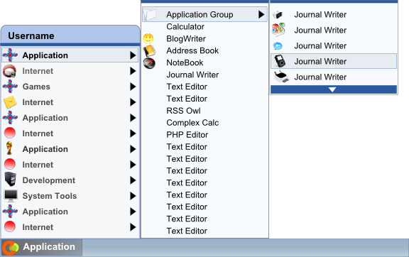
A redesign of the main menu, which would include the user name in it too.
The menu items height should be designed to take little less space, so creating compact menu. Current main menu seems lot expanded.
The width of the menu item should be consistent to the sub-menus too. The icons size will be in this case 1 pixel less from up and 1 pixel less from bottom border lines.
One of the main concern is choosing a font that is too much clear even in small sizes. If not, we should be designing a font specific for menu items, not document or something.
Well thats end of msg. I tried to say these all somewhere. But let me know, if you people too want somethjing like this, I would be interested in giving my time reseaching better look of main menu. Then I will submit the request. Right now i m attaching a simple (quick-designed) main menu idea. give me your opinion.
--
-=Ravi=-
Attachment:
demo.png
Description: PNG image
[
Date Prev][
Date Next] [
Thread Prev][
Thread Next]
[
Thread Index]
[
Date Index]
[
Author Index]
