[Gimp-user] making a faded handwritten letter legible
- From: rich404 <forums gimpusers com>
- To: gimp-user-list gnome org
- Cc: notifications gimpusers com
- Subject: [Gimp-user] making a faded handwritten letter legible
- Date: Tue, 07 May 2019 14:34:41 +0200
I have 2400 dpi images that were scanned of a 19th-century handwritten
letter and they are very faded. I am wondering what to adjust in GIMP
to try and make them more legible. Any help is appreciated.
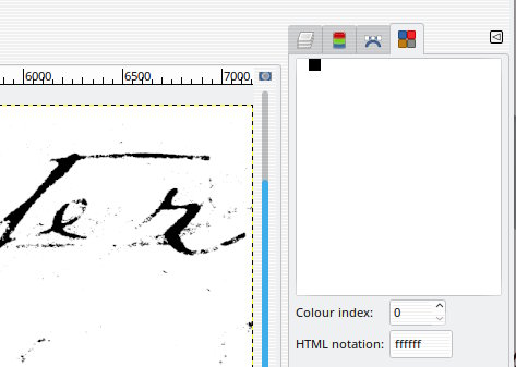
Is the sample the same format as the original scanned image?  The sample is an
indexed 1 bit (black and white) tif. Nothing there except those pixels. In Gimp
use Windows -> Dockable Dialogues -> Colormap See attached clip.

Nothing you can do with that (except guess).

Attachments:
* https://www.gimpusers.com/system/attachments/1170/original/indexed.jpg

--
rich404 (via www.gimpusers.com/forums)
[
Date Prev][
Date Next] [
Thread Prev][
Thread Next]
[
Thread Index]
[
Date Index]
[
Author Index]
