Re: [Gimp-user] distorted text issue
- From: "Joao S. O. Bueno" <gwidion mpc com br>
- To: rich404 <forums gimpusers com>
- Cc: "gimp-user-list gnome org" <gimp-user-list gnome org>, notifications gimpusers com
- Subject: Re: [Gimp-user] distorted text issue
- Date: Thu, 2 Nov 2017 12:42:50 -0200
And, of course, the best tool for this job might not be GIMP at all.

Vector oriented edition programs, such as Inkscape will allow much
better control of text along a path, including in-place editing of the
text. You can then export your final rendering to finish the image in
GIMP.

On 2 November 2017 at 11:41, rich404 <forums gimpusers com> wrote:
Hi All - I'm trying to add some curved text to an image using the text
to path methodology.
I've tried half a dozen fonts - but the all distort to the point of
being unreadable.
Is there a solution to this (that's easy to follow!, I'm pretty basic
lol)

Thanks
It could be all sorts of things
- A high degree of curvature for the path. Sharp corners do not work.
- A very small font size will make for poor quality.
- and of course if the text is too long for the path, it will shoot off to a
corner.
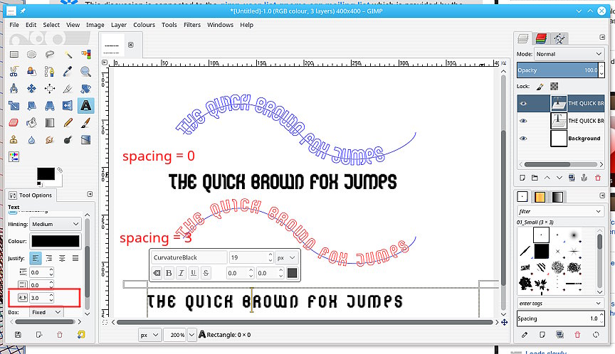
Try increasing the character spacing. You might have to also reduce character
size to fit the path. It is a trade off. see the attached screenshot.
An alternative is a python plugin from
http://sourceforge.net/projects/gimp-path-tools/files/scripts/
The top one at the moment: ofn-text-along-path.zip Unzip it, pop the
ofn-text-along-path.py in your Gimp profile (for Windows
C:\Users\your-name\.gimp-2.8\plug-ins Read the html description of use. It will
make a best-fit to a path as well as better kerning of characters.
rich: www.gimp-forum.net
Attachments:
* http://www.gimpusers.com/system/attachments/733/original/fonts.jpg
--
rich404 (via www.gimpusers.com/forums)
_______________________________________________
gimp-user-list mailing list
List address: gimp-user-list gnome org
List membership: https://mail.gnome.org/mailman/listinfo/gimp-user-list
List archives: https://mail.gnome.org/archives/gimp-user-list
[
Date Prev][
Date Next] [
Thread Prev][
Thread Next]
[
Thread Index]
[
Date Index]
[
Author Index]
