[Gimp-user] distorted text issue
- From: rich404 <forums gimpusers com>
- To: gimp-user-list gnome org
- Cc: notifications gimpusers com
- Subject: [Gimp-user] distorted text issue
- Date: Thu, 02 Nov 2017 14:41:01 +0100
Hi All - I'm trying to add some curved text to an image using the text
to path methodology.
I've tried half a dozen fonts - but the all distort to the point of
being unreadable.
Is there a solution to this (that's easy to follow!, I'm pretty basic
lol)

Thanks
It could be all sorts of things
- A high degree of curvature for the path. Sharp corners do not work.
- A very small font size will make for poor quality.
- and of course if the text is too long for the path, it will shoot off to a
corner.
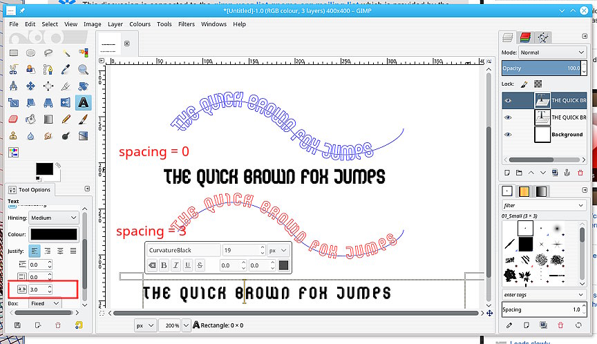
Try increasing the character spacing. You might have to also reduce character
size to fit the path. It is a trade off. see the attached screenshot.
An alternative is a python plugin from
http://sourceforge.net/projects/gimp-path-tools/files/scripts/
The top one at the moment: ofn-text-along-path.zip Unzip it, pop the
ofn-text-along-path.py in your Gimp profile (for Windows
C:\Users\your-name\.gimp-2.8\plug-ins Read the html description of use. It will
make a best-fit to a path as well as better kerning of characters.
rich: www.gimp-forum.net
Attachments:
* http://www.gimpusers.com/system/attachments/733/original/fonts.jpg
--
rich404 (via www.gimpusers.com/forums)
[
Date Prev][
Date Next] [
Thread Prev][
Thread Next]
[
Thread Index]
[
Date Index]
[
Author Index]
