
- The current gray shade doesn't match with all themes, and it visually detracts from the actual message.- It is unnecessarily, because the user already understands that this panel displays the e-mail message.
- It is inconsistent with the rest of the UI, which is "flat"; this portion implies 3-D depth, but we see that nowhere else in the UI. (It may be OK to keep the shadow that outlines the message, but even that can be removed; we already have the shape/outline of the panel to delineate the message area from the rest of the UI).- Note that the "docked" New Message panel does not have the same gray background, so this is an inconsistent appearance for the UI.
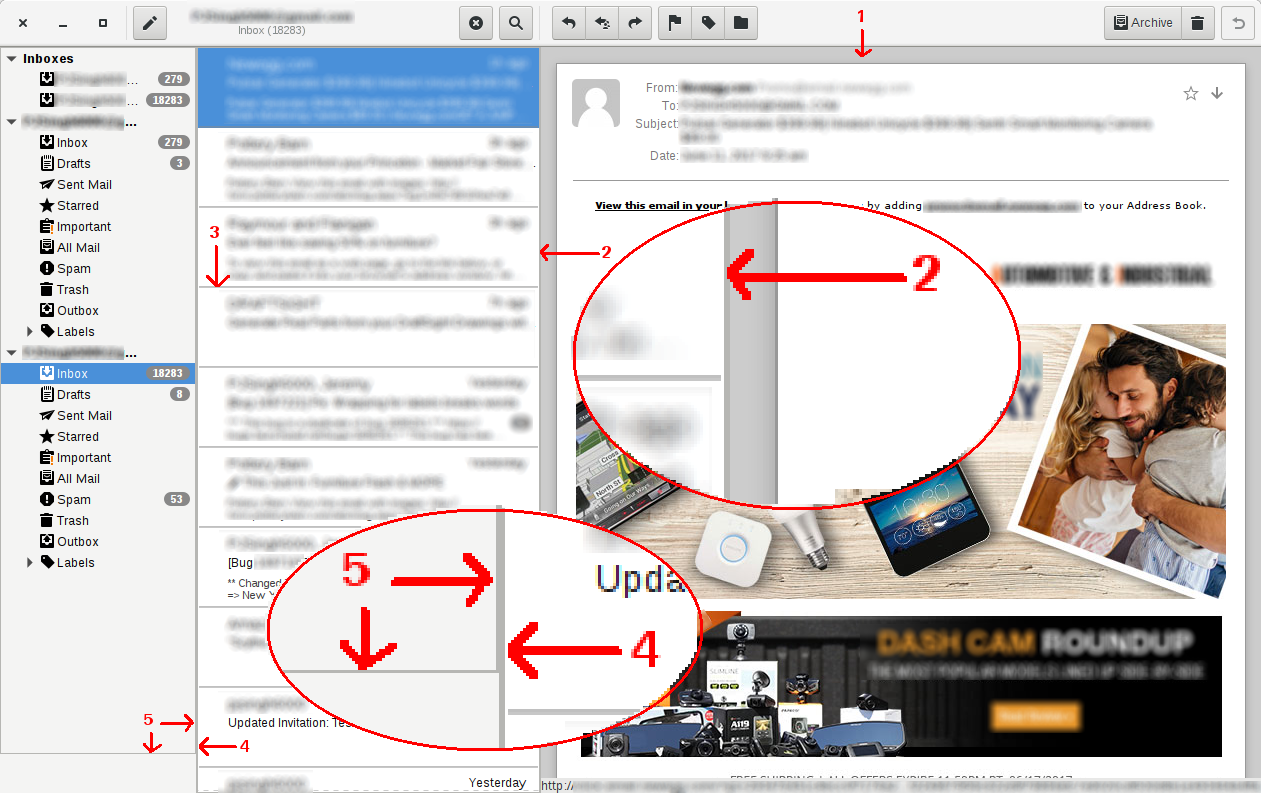
- The vertical border line is too thick and should be a simple 1px line.- The thick line is redundant because the user can visually see that these are two distinct sections: one is clearly a list, and the other is obviously a message.- There is a space gap surrounding the actual message, and this gap is enough for the user to realize that these are two different sections of the UI.
- These are redundant and unnecessary...- There is already a visual gap between the messages, so these extra lines make the UI look cluttered and busy.- The larger fonts used for sender, subject, and date already imply a visual separation between messages in the list.- The horizontal lines distract the user from the most important part -- the content.
- The vertical border line is too thick and should be a simple 1px line.- The thick line is redundant because the user can visually see that these are two distinct sections: the Inboxes panel has a slightly darker background, so we additional visual queues separating these parts of the UI are unnecessary.- The message counts are right justified, and this enough for the user to realize that these are two different sections of the UI.- The thickness of this vertical line impacts the issue in suggestion #5...
- This is unecessary and redundant, since other parts of the UI already have borders.- This makes a double thick border running down 90% of the left portion of the UI. (See the zoom-in bubble for #4 and #5 in the attached image). Removing the frame around the Inboxes panel would remedy this problem.
Would it be possible to use the selected background color (@selected_bg_color) from the current theme as the fill color for the message count bubbles? For example, on Ubuntu, with the default Abiance theme, the bubble should be orange with white text; with the Arc theme, the bubble should blue with white text; etc. Note: if this were done, we would have to invert the bubble and text colors whenever a row with a message count was selected, so this may a bit more effort to implement than the five suggestions above.
Attachment:
Geary 2017-06-11-02-PS.png
Description: PNG image