Re: Evolution Plugins (Was Re: Rise of the Plugins)
- From: Alexander Larsson <alexl redhat com>
- To: Sankar P <psankar novell com>
- Cc: Jeff Waugh <jdub perkypants org>, desktop-devel-list gnome org
- Subject: Re: Evolution Plugins (Was Re: Rise of the Plugins)
- Date: Mon, 19 Nov 2007 11:06:14 +0100
On Mon, 2007-11-19 at 15:16 +0530, Sankar P wrote:
> > However, the window it gives me looks for all intents and purposes like
> > the mailer. It has quick buttons to switch to the mailer, it has a
> > send/receive button on the toolbar. This just doesn't feel like the
> > ideal UI you would create if you wanted to do an excellent address book.
> >
> > For instance, the toolbar could totally go away, as can the status bar
> > and the fast switch buttons. A bunch of generic mailer stuff could be
> > removed from the menus too. In general the app could be made smaller and
> > tighter, feeling more like a utility window that you can bring up
> > quickly when you want someones address, rather that some large
> > application you start up and navigate around.
>
> May be you can try:
>
> View->Layout
> view->Switcher Appearance->Show/hide buttons
>
> It is a pity that these settings are not component-wise :(
Exactly, which makes them useless (well maybe not show/hide buttons, but
things like show toolbar/sidebar), because I want them in the mailer.
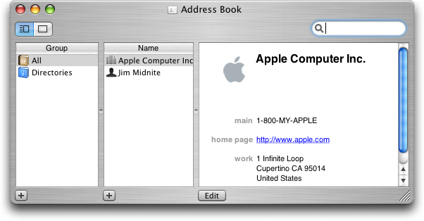
> > Also, the general layout of the address book seems more or less
> > inherited from the mailer. I think for instance the OSX layout is better
> > suited to display contacts:
> >
> > http://www.guidebookgallery.org/pics/gui/applications/office/addressbook/macosx103-1-1.png
> >
> > Lists of names are easier to scroll vertically, since you then display
> > more of the text (as text is horizontal) and more names (they stack well
> > vertically).
>
> *nod* *nod*
>
> Absolutely. The first thing I do whenever I launch Evolution addressbook
> in a new machine is to switch to
>
> [From address-book component]Menu -> View -> Phone List
Hmm, didn't know about that! Its much nicer, but a bit busy by default
with showing so many columns. What if it only showed prefered email
address and prefered phone nr by default?
Also, preview is still on bottom so as soon as you enable that its much
harder to browse in the list. Even when there is lots of unused space
availible to the right, since I just removed a bunch of the columns in
the listview...
> > Btw. am I the only one who is totally pissed off when reading a mail and
> > you need to check e.g. the addressbook or calendar for some info and
> > this makes the mailer, including the current mail just go away, totally
> > killing your state. Its certainly *possible* to get the calendar in a
> > separate window, but thats far harder and requires multiple steps, so
> > its not what you typically do.
>
> I personally will use gnome-clock-applet and "To" button in the composer
> - (ENameSelector) in that case. However, it may not be the best solution
> that can convince everyone though :)
>
> File->New Window is another option that one can give a try.
Its not that I don't know how to do it. Its just that there is a huge
button that says "calendar" and there is the "obvious" menu entry
view->window->calendars that you're more likely to use. But if you use
these then evolution punches you in the face, so you have to figure out
workarounds like a two-step operation via new window or using the
launchers from the gnome menu.
> I admit that component-specific customizable Toolbars may make more
> sense.
Why not go whole-hog and do per-component toplevel window designs. :)
Thats more or less what you get if you make everything about the window
per-component specific, but in a much more complicated way.
[
Date Prev][
Date Next] [
Thread Prev][
Thread Next]
[
Thread Index]
[
Date Index]
[
Author Index]
