
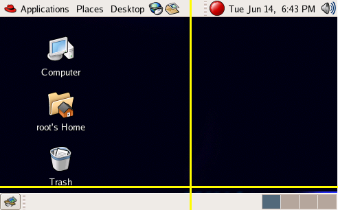
Hi ~

I've attached a little compressed layout that I use to look at the real
important areas of the desktop.  The yellow lines represent the areas
that were cropped.

That's the task bar on the bottom with the show desktop and workspace
switcher applets.

These are some observations that I've seen and feedback that I've gotten
from the panel layout we use as default in Fedora.

The 'Show Desktop' button on the bottom confused a lot of people into
thinking it was a Windows style start button.  I got a number of reports
of people clicking on it a lot trying to get the start menu to appear.
I'm planning on removing that from the default for next release.

The volume capplet should be to the left of the clock.  People would
rather throw their mouse up to the right to click on the calendar than
click on the volume.

The Applications/Places/Desktop button wasn't obvious that it was a
button and instead looked like plain text.  I guess requires some theme
fixes or something?

Other than that the desktop is probably going to stay about the same.

We've put the notification area icon to the left of the clock and it
seems to work well there.  I believe there's some consensus in the
distros for that location.

This is the new stuff I'm thinking about, perhaps people can share
opinions about this.  Not opinions about I like this or that, but maybe
a I'd put it here because I've noticed people often doing this [1].

I'm considering putting the trash applet in the bottom left corner.  I'm
not sure why Ubuntu chose the bottom right, maybe they can answer that.
I think it's because that's where the Mac puts it, but I don't know.
The bottom left seemed more appropriate for the GNOME desktop since all
of our files drop on the desktop from the left to the right.  Where as
the Mac drops them in the opposite order.  If you're a Fitt's law
nut ;-) you'll notice right away that new files placed on the desktop
will be close to the left and therefore a trash on the left would
decrease the mouse distance you have to move.  Other reasons for putting
include the fact that the workspace switcher is already on the right and
works ok there.

I'm also looking into removing the Computer/Home/Trash icons from the
desktop.  I saw that Ubuntu does it and I've read a research paper
detailing how people didn't know the difference between items on the
desktop that were theirs and items that were the computers.  Easiest
solution to this is to make all the items the users items.

Oh and I'd love to lose that blinking red icon... ugh. :)

Cheers,
~ Bryan

[1] Just to note that if you're on this list you're probably not a
target user.  So you have to talk about other people or fake it the best
you can. ;-)
Attachment:
Screenshot.png
Description: PNG image