
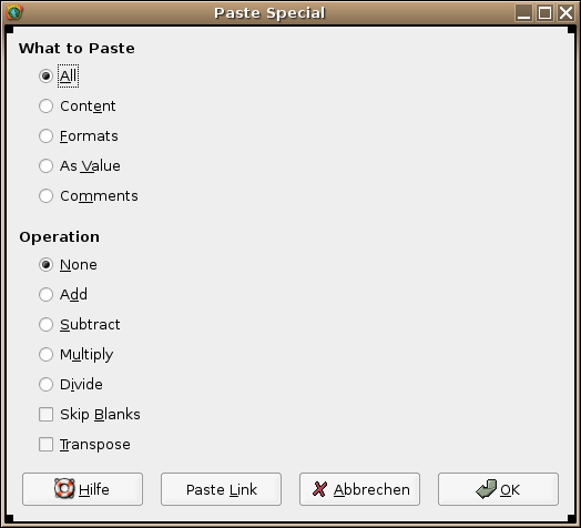
Hello usability folks!

I'm currently trying to HIGify the Gnumeric "Paste Special" dialog. I'm
totally unconfident with the current layout, but don't know how to
resolve the issues in a clean fashion. I've attached a screenshot of my
current mockup. The issue seems to be that the dialog has a lot of white
space and many widgets, which could be resolved by adding comboboxes for
the "what to paste" items and the mathematical operations; note that the
backdraw of comboboxes is that options are "hidden away" in subwidgets,
which Jody doesn't want.

regs,
Chris
Attachment:
paste-special.png
Description: PNG image