[Usability] GTK+ 2.0.x drop-downs
- From: gnome atu cjb net
- To: usability gnome org
- Subject: [Usability] GTK+ 2.0.x drop-downs
- Date: Sun, 7 Mar 2004 11:40:15 -0700 (MST)
I have been very impressed with the graphical improvement of GTK+ 2.0.x since I started using it last year, but have come upon something that I consider to be a major usability problem regarding the implimentation of drop-down widgets.
When drop-downs are clicked, the currently chosen item is forced to appear at the location where you clicked. The side effect of this behavior is that the position of all the remaining items in the list is thereby forced as well. If the drop-down is in a window that is roughly in the center of the screen, this works without any problems. However, as soon as you move that drop-down to the top or bottom of the screen, and select an item in that drop-down that is near the wrong end of the list, you end up with a frustratingly messy layout.
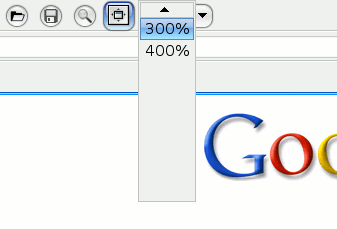
I have taken a screenshot and a desktop video capture of this problem, as it is easier to show it visually than try to describe it with words:
Screenshot, PNG format (7.0KB):
http://www.vcn.bc.ca/~raven/Screenshots/GTK+_2.x_Drop-Down_Menus.png
Video Capture, MPEG-4 AVI format (638KB):
http://www.vcn.bc.ca/~raven/Video_Capture/GTK+_2.x_Drop-Down_Menus.avi
I feel this is a serious mistake against the usability of GTK+ 2.0.x programs, and I am sure that I am not the only one frustrated by these additions. My average access time for an item in a drop-down widget from GTK+ 1.2.x to GTK+ 2.0.x has gone from roughly half a second to around two seconds.
The problems with this method as I see it are that:
* There is no quick way to traverse a long list (such as a scroll-bar)
* Blank space (sometimes large amounts) is left where items could be effectively displayed
* Very different visual results occur depending where on the screen you open the drop-down
* The larger the list is, the worse the problem becomes
When the list has many items it can take as much as 20 seconds to get to the item you wanted to choose. While I am aware that the recommendation for drop-downs is to not put more than 10 or so items in one, it just doesn't happen that way in the real world. Even in some of the longest establisheed GTK+ apps, such as The GIMP itself, have long drop-down lists.
My recommendation for how to remedy this problem would be to keep the current layout when it is in the middle of the screen, but when an edge is close it would displace the drop-downs rectangle so that there is no blank space showing. Just fill up blank areas as it stands now, no more/no less is really needed.
When I asked about this on irc.gnome.org/#gtk+ I was told that this was not a bug, that it was intentional. Perhaps if enough people were made aware of this problem then something could be done to improve the situation.
At present I find myself shying away from using GTK+ 2.0.x apps due to how frustrating it is to use these drop-downs. I use my keyboard and mice interfaces quite efficiently, and these drop-downs force me to slow down so much it is like waiting for paint to dry when using them, especially when using a drop-down repeatedly to check out an effect.
If any of you read all that, thanks !
Good day,
- raven morris
[
Date Prev][
Date Next] [
Thread Prev][
Thread Next]
[
Thread Index]
[
Date Index]
[
Author Index]
