
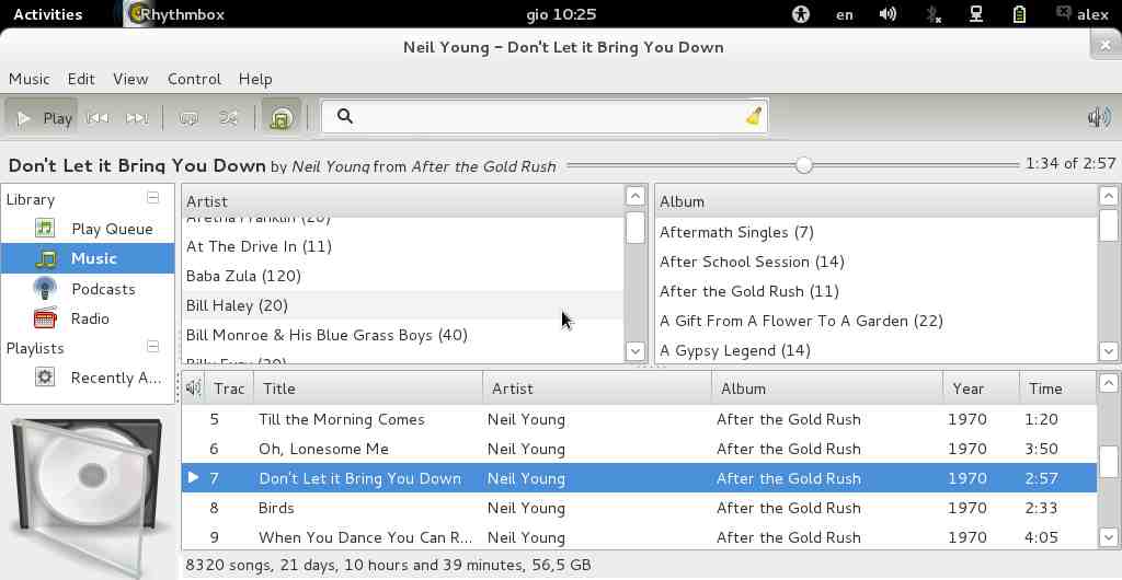
Rhythmbox doesn't serve well its scope on screens up to 10", that's for
sure.

In this 40kbytes mockup 3 little things' changed to save a lot of vertical
space.
1. status bar doesn't cover side pane (if an overlay status bar wouldn't
be possible to implement)
2. searchbox has been reorganized to more modern standards and moved in
a more prominent place. A click on the lens changes between n filters.
3. song progress bar has been moved between song title end song time.
Song title can reduce by 1-2 points font height.

that's all, the changes are not trivial and probably not difficult to
achieve; the result it's nice.

thanks, good job.
alex
Attachment:
toorhythm3rd.jpg
Description: JPEG image