[Rhythmbox-devel] Jorn V's Luca (Was: Resuming a week of hard mochuping)
- From: MArk Finlay <sisob eircom net>
- To: Luca Ferretti <elle uca libero it>
- Cc: rhythmbox-devel gnome org
- Subject: [Rhythmbox-devel] Jorn V's Luca (Was: Resuming a week of hard mochuping)
- Date: 15 May 2003 10:26:12 +0100
> 1. real devices, iTunes and WMP use a little bigger play button!
This idea makes sense to me. Hopefully we can fit it in in some way.
> 1. The best is label on left, checks on right, so we can use the
> label to show menu item's tooltips
> ___________________________________________________________
> | 45 songs, 34:23 total []Shuffle []Repeat |
I woluld disagree with this. The status is showing the status of the
song list which is on the right, so it makes sense to have the status on
the right. Also the shuffle and repeat controls make more sense to me
vertically below the play controls.
> --> Add Special Action Button
I think it's better to remove it. It may look cool, but i'd prefer to
have a good "Tools" or "Actions" menu. The major problem with the old rb
was menus changing between sources. I think that having a button doing
the same would cause the same problems, confusions and frustrations.
> In mp-summary.glade there are some assembled windows using all previous
> mockups/ideas. I like all them (and all plausible variations using
> legoland stuff): I can't choose one :-(
These all "make sense" from a design point of view, and they are more
symmetical than jorn's latest (e.png) which I like. But they do lack the
browser toggle which I'm told is very important and I tend to agree. I'd
love to see if you can fit that in somewhere without destroying the
symmetry.
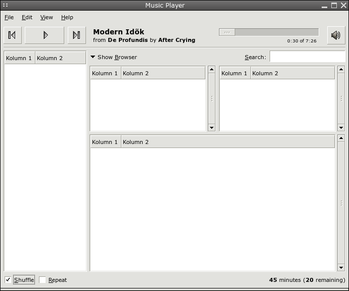
I've attached a modified version of jorn's e.png with a bigger play
button cus I love that idea. I've also attached a modified version of my
favourite one of Luca's glade-ups.
I'm really not sure which one of these I prefer. I REALLY don't like the
lack of symmetry in Jorn's one, but I'm not mad about how big the
toolbar area is in Luca's. But on comparing them Luca's toolbar isn't
really that much bigger than Jorn's one, it just feels bigger because
the source list is a lot lower.
At the same time, There is not doubt in my mind that Luca's would be A
LOT easier to use for the new user, and probably the experienced user
alike. It has three clearly defined areas. You can look at it an
instantly know what everything does.
It would be great if we could compact the toolbar slightly, but even if
we couldn't i still think that Luca's is probably a better look to go
with. Usability IS what gnome is all about after all.
--
.--= [ MArk Finlay - sisob ] =--.
[ Gnome User's Board : www.gnomesupport.org/forums ]
[ Public Key: http://evolvedoo.sf.net/sisobatericomdotnet.asc ]
e-sisob.png
mp-summary-sisob.tar.gz
[
Date Prev][
Date Next] [
Thread Prev][
Thread Next]
[
Thread Index]
[
Date Index]
[
Author Index]
