
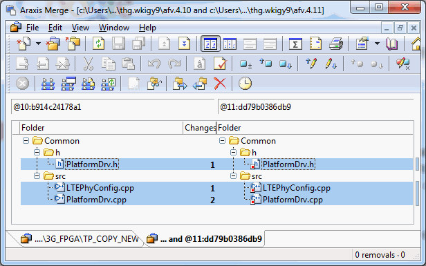
Hi again,

I just wanted to let you know that a couple of days ago I replied to
this email and I attached a screenshot showing how the labels are hard
to see in meld. The attachment was bigger than the 40 KB limit allowed
by the list so I think it is stuck in moderation.

In that reply I promised to send a similar screenshot of how Araxis
Merge handles labels comparison. I attach it to this email. The
screenshot is smaller (21 KB) so hopefully it will not need
moderation.

Cheers,

Angel

P.S.- Do you guys top or bottom post on this list?


On Fri, Jan 25, 2013 at 9:36 PM, Kai Willadsen <kai willadsen gmail com> wrote:
> On 22 January 2013 04:34, Angel Ezquerra <angel ezquerra gmail com> wrote:
>> Hi again,
>>
>> I am current integrating meld with the TortoiseHg mercurial client, of which
>> I am one of the developers. We were already able to run meld on Linux but
>> now that there is a nice Windows installer I'd like to be able to do so from
>> windows as well. In doing so I've been using meld for a few days (I had not
>> used it before because I normally use Windows), and I've noticed a few
>> things that could make our integration a bit better.
>>
>> In particular, we use "label" command line options to modify the title that
>> meld shows when performing a diff in order to tell the user which file
>> versions are being diffed. This works fine, and puts this information both
>> on the meld window title and on the diff "tab". However this information is
>> not very easy to see for two reasons:
>>
>> 1. The window title is transparent on Windows 7. Depending on the background
>> it can be a bit hard to read.
>>
>> 2. The tab handles have a fixed size, and they do not expand with the tab
>> label contents. This means that in general the text that is shown on the tab
>> cut off, only showing part of the whole label. In most cases you can only
>> see part of the label of the first file that is being diffed.
>>
>> In addition, setting the label does not change the text of the file
>> combobox. This is a pity because the combobox is big enough to show the
>> label, and because it is where your eyes are naturally drawn when the meld
>> window is open. It took me a little while to realize that I could see the
>> labels on the meld window title.
>>
>> So I'd like to propose a couple of possible improvements:
>>
>> 1. Let the tab size increase to fit the label
>
> Having a fixed tab size is a deliberate decision, as variable-width
> tabs turn out to be a nightmare in practice. All it takes is a
> comparison between two
> CustomerSingletonInstanceCreatorSettingsFactoryFactory files, and your
> window now contains a single tab.
>
> You can try this yourself by commenting out lines 46 and 55 of
> notebooklabel.py (i.e., don't set ellipsization, and  don't set a size
> request). My feeling from having tested it ages ago is that it works
> okay for many cases, and then it breaks the UX.
>
>> 2. Show a "label" text on top or below of the file combobox, showing the
>> label corresponding to the file. Alternatively, replace the actual file name
>> with the label (this is what Ataxia Merge does and it works pretty well).
>
> Meld actually relies on those comboboxes containing the files being
> compared in several places, so we flat-out can't do this. In my WIP
> branch for a newer comparison UI, I've relaxed some of those
> restrictions, so it might be doable in the future.
>
> Showing label text above or below would be technically possible, but
> I'm very sensitive to good use of space within our UI. The problem is
> that in most cases, the label text is totally superfluous once you
> have the file path in the combo, so it only makes sense to show the
> extra label at all when the value in your combo doesn't matter. As
> such, one option would be to hide the combo entirely if we have a
> command-line-set label text, replacing it with a gtk.Label containing
> the full label text in that case.
>
> The recent change to pack the file selectors into an HBox will have
> made this replacement easier. If anyone would like to look at this,
> let me know and I'll provide some pointers.
>
>> These labels are very important in the context of a version control tool
>> such as TortoiseHg. They are essential to let the user know the versions
>> they are working with. In this context the actual file names are often not
>> very important because they are usually temporary files that are taken from
>> history (e.g. to compare a certain file revision with the current working
>> directory version).
>>
>> So I think making these labels more visible is important. I believe any (or
>> both) of my suggested changes would make using meld with TortoiseHg (and
>> similar tools) nicer.
>
> I appreciate why you're asking for this, and I think it would be good
> to fix somehow. Could you provide some examples of labels that don't
> fit, so I can get an idea of how big a difference we're talking about
> here?
>
> cheers,
> Kai
Attachment:
araxis_merge_labels.png
Description: PNG image