RE: Alternative DnD cursors
- From: "Marc Flerackers" <mflerackers androme be>
- To: <gtk-devel-list redhat com>
- Subject: RE: Alternative DnD cursors
- Date: Mon, 24 Apr 2000 18:31:54 +0200
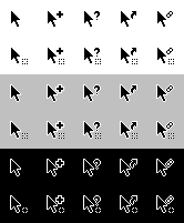
Personally I like them better black with white border, since, as explained
on http://www.mackido.com/Interface/Color.html, it gives better contrast on
white. I would also increase the thickness of the question mark and the plus
sign, since they are quite tiny.

I attached an example of these changes. I included two link icons, I think
the link (two rings) is more international than the shortcut sign.

I don't know if the stippled rectangle is needed, since in gtk a shaped
window follows the icon (with a file for example) while dragging.

--
Marc Flerackers (mflerackers@androme.be)
Software Engineer
ANDROME NV

> -----Original Message-----
> From: damon@mail.redhat.com [mailto:damon@mail.redhat.com]On Behalf Of
> Damon Chaplin
> Sent: Sunday, 23 April, 2000 00:47
> To: Gtk Developers List
> Subject: Alternative DnD cursors
>
>
>
> Here's my attempt at some better DnD cursors.
> Build & run the attached program to see them and compare them with
> the current ones.
>
> Also, do we have to stick to a size of 16x16?
> Maybe we could try to use nicer 32x32 cursors by default and fallback
> to 16x16 if needed. (How many systems are limited to 16x16?)
>
> Damon
cursors.png
[
Date Prev][
Date Next] [
Thread Prev][
Thread Next]
[
Thread Index]
[
Date Index]
[
Author Index]
