Re: charts: labels, lines
- From: Jean Bréfort <jean brefort normalesup org>
- To: Al Lelopath <allelopath hotmail com>
- Cc: gnumeric-list gnome org
- Subject: Re: charts: labels, lines
- Date: Sat, 05 Feb 2005 08:46:45 +0100
Le vendredi 04 février 2005 à 21:27 +0000, Al Lelopath a écrit :
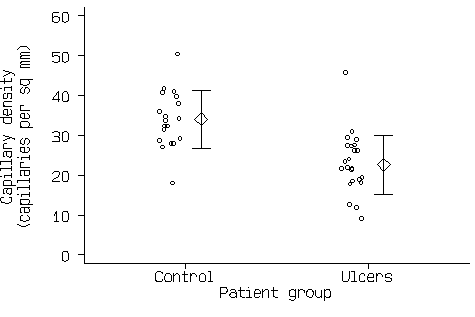
I want to create a chart something like this:
http://www-users.york.ac.uk/~mb55/talks/upset3.gif
I'm mostly there, but for 2 things:
1. I would like to have labels on the axes, describing what they are, e.g.
"Week #" on the x axis.  I don't see how to do that.
In the property box, select the axis, click Add, Label. If the entry
does not exist update gnumeric to a more recent version.
2.  I've got the diamond for the mean and little horizontal lines for the
upper and lower standard deviation values, but i would like vertical lines
going from the diamond to the corresponding horizontal lines  How can i do
this?
Error bars should be the solution. The support in  1.2.13 was limited.
So, if you don't find them, please upgrade.

Regards,
Jean
[
Date Prev][
Date Next] [
Thread Prev][
Thread Next]
[
Thread Index]
[
Date Index]
[
Author Index]
