
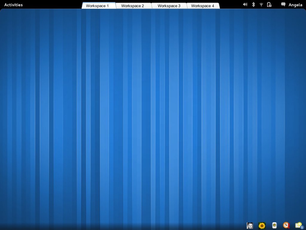
This e-mail is a responds to the thread 'Let's make it really easy for users interface'.


Hello GNOME deverlopers,

First, thanks for all the feedback!
Second, I made a new mock-up (see attachment)! I believe this design fits more in the GNOME 3 design.

@D.H. Bahr:

As you can see in the second mock-up all kind of variants are possible. Keeping the clock in the top panel shouldn't be a problem.

@Tim Murphy:
Yes, the advantage is that the tabs are always visible. However, you could add an animation so that the tabs are only visible when you hover over the top panel. This way you can keep the clean design of GNOME 3.


@Adam Tauno Williams:
You suggest to use keyboard shortcuts to switch between workspaces. This isn't a good solution to the problem because:
* The solution is invisible to the user.
* The solution is too technical for the average user.
* You need more hands (two hands instead of one)
* You need more hand movements (two instead of zero) (two: mouse --1--> keyboard --2--> mouse)
* You need more fingers (three instead of one)

The advantage of workspace tabs is that the user only needs one mouse-click to switch between workspace (and, if organized well, between applications).

The use of workspace tabs doesn't completely take away the need to switch between application but does minimize it a lot.

A big advantage of workspace tabs would be that you make it very clear to user how you want him to use the desktop: You want him to use workspaces to organize his work.In the current design of GNOME 3 the workspaces are made insignificant by hiding them in the overview mode.

Looking forward to your feedback.


Yours sincerely,

Jeroen Verhoeckx
Attachment:
tabs_workspaces_new.jpg
Description: JPEG image