Re: [gnome-cyr] Bitstream Vera with cyrillic
- From: Danilo Segan <danilo gnome org>
- To: gnome-cyr gnome org
- Subject: Re: [gnome-cyr] Bitstream Vera with cyrillic
- Date: Wed, 17 Dec 2003 17:46:22 +0100
Hi Alexander,
Alexander Kirillov <kirillov math sunysb edu> написа:
> Thanks for doing this. I checked it out and found one major problem:
> Cyrillic "a" (а) has very little whitespace on left and right - much
> less than the original Latin "a" (I am probably not using the correct
> terminology, but you understand what I mean...), so in text, it is shown
> too close to the letters before and after it. To a lesser degree, I
> find spacing of Cyrillic "ya" (я), "l" (л) and "T" (Т) also too
> small. See attached scrrenshot.
Thanks for pointing it out. Since I didn't check all the kerning
pairs, much of them where left out. Also, there really were some
problems with "l" (л) and "a", but others were simply an effect of
bad kerning (uppercase "Т" is copied verbatim from latin "T").
I've used Pfaedit's Auto-Kern for the time being, and corrected base
glyph widths for some, so I hope it's more usable now. Please report
any other (or same :) ommisions you find.
"Russian" glyphs (i.e. those cyrillic glyphs used in Russian, but not
in Serbian) can easily be flawed, so please *do* report if anything
is wrong with them -- I may have done something completely
inappropriate without knowing it.
Btw, you might find small "b" to be inadequate for Russian -- this is
the variant of the glyph as used in Serbia. Differences are subtle,
sort of where the hook "takes off": Russian one looks more like "6",
while Serbian one is closer to Greek delta "δ".
> I could try fixing it (shouldn't bee to hard with pfaedit) - but I know
> almost nothing about fonts. Valek Filippov would do it much better than
> me.
Fix is in the CVS, and TTF is at the same place as before (I replaced
it with new file): http://kvota.net/fonts/Bepa-Roman.ttf.
I've just dropped TTF in my ~/.fonts/, and I use it without any
problems. Since I use Freetype2 *without* patented bytecode
interpreter, it makes use of autohinting built into it for TrueType
fonts (I have found out that this gives better results even for
hand-hinted fonts like those MS fonts from Monotype).
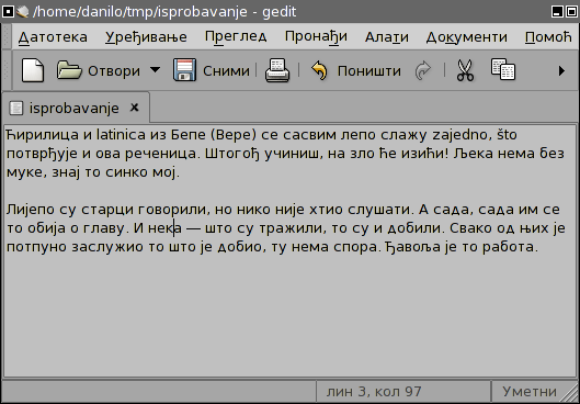
I've also added a screenshot with some silly Serbian text in gedit
at http://kvota.net/fonts/gedit-bepa.png (and gedit is also
translated to Serbian, and is using Bepa for UI).
Cheers,
Danilo
[
Date Prev][
Date Next] [
Thread Prev][
Thread Next]
[
Thread Index]
[
Date Index]
[
Author Index]
