[Glade-users] [Glade-devel] Making property editor as big as posible!
- From: juanpablougarte at gmail.com (Juan Pablo Ugarte)
- Subject: [Glade-users] [Glade-devel] Making property editor as big as posible!
- Date: Fri, 08 Mar 2013 14:28:07 -0300
On Fri, 2013-03-08 at 16:18 +0900, Tristan Van Berkom wrote:
On Fri, Mar 8, 2013 at 3:35 PM, Juan Pablo Ugarte
<juanpablougarte at gmail.com> wrote:
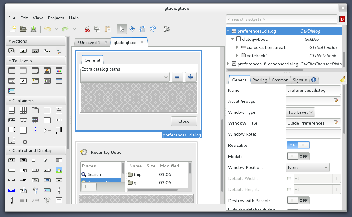
Hi guys, I am trying to polish the Glade UI and one of the goals is to
make better use of vertical space in the property editor so we can fit
more properties at the same time.

There are a few modification in 3.15 as mention in my blog post

https://blogs.gnome.org/xjuan/2013/03/06/glade-drag-drop-support

But now I am playing a little bit more and choose a somewhat unorthodox
layout for the UI I basically took out the inspector/property editor out
of the hierarchy and put it on a side so that it can take the whole
vertical space of the window (no more wasted space by the menu and tool
bar)

https://blogs.gnome.org/xjuan/files/2013/03/glade_new_layout.png

I must say it looks odd at the beginning but after a few minutes it gets
better :)

What do you guys think?
Hi Juan,
   I don't think it's a good idea at all to "chop" the menubar/toolbar off the
way you did (it looks so unnatural and it's so non-standard that I can't
agree with it) *but* perhaps something can be salvaged from this...
Yeah I know I would not either, I was just playing and wanted to share
it. I got to tell that having the UI made with glade makes it very easy
to play with it! heheh but what I was trying to do was move the status
bar under the workspace, but that also looks bad.
One thing that I find interesting about this experiment is that, perhaps
it could be nice to place the <search widgets> entry in the toolbar aligned
to the right hand side (this would save vertical space from the inspector &
Yes that would be good!
property editor zone without creating this really weird interface, also it
would be a natural place to put the search entry I think, similar to firefoxes
search entry and not so far off from where Glade originally had it).

Also, I still really don't like what you've done to the "Docs" and "Clear"
buttons, they should really be implemented as contextual "actions"
and automatically appear in the context menu (as the Docs already
does) or optionally in the toolbar (perhaps the "Docs" button should
also appear in the toolbar).
Well you can set the default value from the property editor contextual
menu, but adding a clear properties context menu item sounds even better
than adding an item to the toolbar.
I think that we can remove the "Clear" button completely, I think
I recall Vincent Geddes arguing the same thing; the "Clear" button
is probably never used.

So I would prescribe:
  a.) Remove the "Clear" button altogether
  b.) Make sure the "Read Documentation" feature is implemented
       as an action, and make it "important" so that it also shows
       up in the toolbar.
Yup, sounds good!

greets

JP
[
Date Prev][
Date Next] [
Thread Prev][
Thread Next]
[
Thread Index]
[
Date Index]
[
Author Index]
