[Gimp-user] Why is lettering not clearer?
- From: rich2005 <forums gimpusers com>
- To: gimp-user-list gnome org
- Cc: notifications gimpusers com
- Subject: [Gimp-user] Why is lettering not clearer?
- Date: Sat, 05 Aug 2017 09:40:38 +0200
Hi,
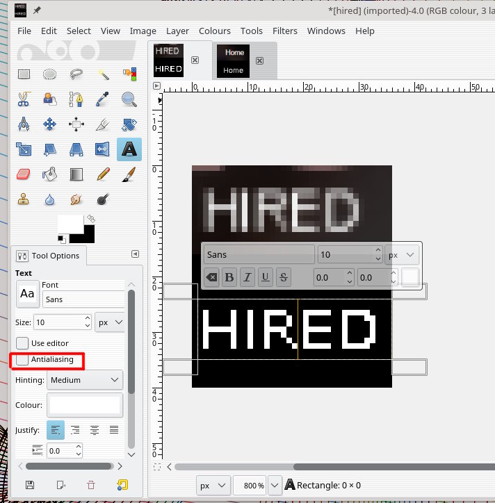
I created a logo and uploaded to a web page, as you can see by the
attached image "HIRED", the lettering/text doesn't look clear. It is
Arial 11 on a transparent background.
Gimp 2.8
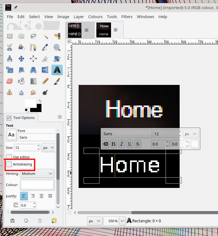
The link to the home page "Home" is attached. it is not part of the
logo, but looks much clearer on the web page.
Is there something I can do to help make the logo text
sharper/clearer?
Any help will be appreciated.
Not a guess this time.

The size and weight of the font is too small. By default Gimp applies
anti-aliasing, hence those semi-transparent pixels. Because of the small size
they dominate.

You can turn off anti-aliasing for text in the tool options and get the results
shown. Not wonderful but then one is 7 pixels high and the other 9 (with lower
case smaller).

The typeface (font) also makes a difference, some will look even worse, Arial
for example.

Attachments:
* http://www.gimpusers.com/system/attachments/644/original/7pix.jpg
* http://www.gimpusers.com/system/attachments/645/original/9pix.jpg

--
rich2005 (via www.gimpusers.com/forums)
[
Date Prev][
Date Next] [
Thread Prev][
Thread Next]
[
Thread Index]
[
Date Index]
[
Author Index]
