
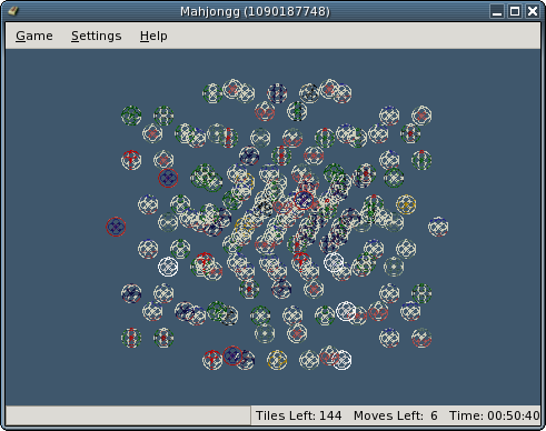
On Wed, 2004-07-14 at 17:52 +1200, Callum McKenzie wrote:
> On Wed, 2004-07-14 at 00:27 -0500, Shaun McCance wrote:
> > > I want to get some discussion going about what themes and settings to
> > > use in screenshots for gnome-games documentation.  Along with themes,
> > > most of the games allow you to toggle the toolbar.  Should the toolbar
> > > be enabled for screenshots?  Also, many of the games allow you to set
> > > the background color, so that should be decided as well.
> > >
> > > In general, there's always at least one good reason to stick to whatever
> > > the default setting is.  But sometimes the default setting doesn't make
> > > for good screenshots, or has color problems.  In some cases it might
> > > just be a good idea to change the default anyway.
> We should stick with defaults. The person reading the help file is
> probably not familiar with the game and will only have seen it in it's
> default guise. Showing something different will not be helpful, they
> will either be confused or think they have an old version of the manual.
> If they don't look pretty then we should be changing the default, not
> changing just the screenshots.

Yeah, I tend to agree.  In general in technical documentation, there are
times when it's appropriate to vary the default look for screenshots.
But I don't think that's very wise here.  Generally varying anything
more than colors and sizes is too much, and there are limits there.

> > > Here's the rundown and my opinion:
> By the way, you don't seem to be using the latest gnome-games. I'll
> explain as I go along.

Actually, I built from CVS just before I sent this.  Odd.

> > > AisleRiot: The default theme is fine, with the yellowish backs of cards.
> The themes will change before the final release of 2.8, once I get an
> SVG card-set sorted out.

Rocking.

> > > Five or More: Definitely shapes.  Shapes rocks.  I think it should be
> > > the default.
> But the parallelogram is an horrendous green ! I should know, I chose
> it.

I find the parallelogram color very close to the four-pointed star
color, but I don't complain because they're shapes.  I'm probably not
the best person to comment on how good colors look.  By the way, I set
the background color to the widget background color.  I don't even know
what the default is.

> > > Mahjongg: With the awesome scaling stuff, default feels pixelated and
> > > ugly now.  I'm pretty fond of smooth.
> The default is now an updated version of post-modern.

Attached is what post-modern looks like on my machine.  I don't know
what's wrong.

> > > Gnibbles: Worm colors?
> I'm sorry, what are you suggesting ?

Well, there's four worm colors.  It doesn't show the actual colors in
the preferences dialog, and I'm too lazy to play the game long enough to
get them all to show up.  Of course we should use the default.  I'm just
mildly concerned about whether the defaults are good for color-blind
users.

> > > Same GNOME: Marbles, planets, stones all look nice.  Are there any plans
> > > to make this one scalable?  Planets grayscales best.
> There are plans to make everything scalable. Somethings just take more
> time than others :).

Rocking again.

--
Shaun
Attachment:
Screenshot-Mahjongg.png
Description: PNG image