Re: [evolution-patches] mail HIG patch
- From: Tuomas Kuosmanen <tigert ximian com>
- To: JP Rosevear <jpr ximian com>
- Cc: mccann jhu edu, evolution-patches lists ximian com
- Subject: Re: [evolution-patches] mail HIG patch
- Date: Sun, 11 Jan 2004 17:32:05 +0200
On Sat, 2004-01-10 at 17:47, JP Rosevear wrote:
Ok, so I set up some screenshots modulo most of the separator stuff for
review by Tuomas:

http://primates.ximian.com/~jpr/screenshots/mail-hig-1.png
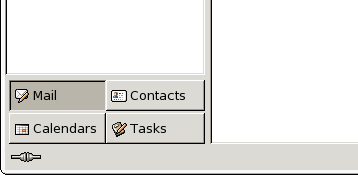
This looks nice. I assume the main thing here is the component buttons, that look nice.
One nitpick though: there's a bit of space on the right of the buttons compared to the folder tree edge - those could align right flush with the folder tree widget. Also, like on the mockup below, it could have the same border padding around:
Otherwise it looks spiffy.
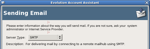
http://primates.ximian.com/~jpr/screenshots/mail-hig-2.png
This looks nice. I am sometimes pondering whether the padding in the HIG is sort of excessive, but on the other hand, I rather choose consistency anyway. The bigger issue behind the pixel-wide paddings is that Gtk should use fontsize-based measurements so that you get smaller padding when using a smaller font. Currently it's hardcoded.
But the first section (
Account Information) has one pixel too big right margin - the "Name:" -field is 3 pixels to the left compared to the next sections on the dialog.
http://primates.ximian.com/~jpr/screenshots/mail-hig-3.png
http://primates.ximian.com/~jpr/screenshots/mail-hig-4.png
These look fine.
http://primates.ximian.com/~jpr/screenshots/mail-hig-5.png
Looks nice, but I guess the dialog could be a bit less wide, thouhg I dont know how easy it could be done. Do druids have some default size or something?
Btw, why is the background color different? Some of the druids have had that on other occasions too, I wonder if that is intentional? I think it should be the same gtk background color as other stuff uses. It's not a huge issue though, just cosmetic stuff that caught my eye.
http://primates.ximian.com/~jpr/screenshots/mail-hig-6.png
http://primates.ximian.com/~jpr/screenshots/mail-hig-7.png
http://primates.ximian.com/~jpr/screenshots/mail-hig-8.png
These look OK too. On #7 the custom commandline field could be full width since the commandline is likely to be long, so it would be better to use all the space the dialog has.
Also: On the druids the "help text" on the top has uneven padding on top compared to the bottom: it is aligned slightly to the bottom on the vertical spacing. Also some of the dialogs have a lot of padding on the sides even thouhg there are several lines of text - sure it is easier to read too when you dont have very long lines, but this needs to be consistent with something. I'd suggest we use the HIG border padding and have the text box be full dialog width minus border, and lets add to the bottom border a few pixels so it is centered:
http://primates.ximian.com/~jpr/screenshots/mail-hig-9.png
The dialog looks nice, but it has no border for the bolded title - the whole dialog needs to have a consistent padding, this is too narrow. IIRC it was 12 pixels. This is less. Otherwise it's fine though.
I'm a little concerned about the label of spaces issue as well - how
many spots is it used in?
You mean the "4 spaces" thing or what?
I agree with you that this stuff should really be built into GTK and Gtk should just make it easy to make stuff HIG-compliant (sensible defaults etc) and apps like Glade should default to the same.
Tuomas
--
Tuomas Kuosmanen :: Art Director, Ximian :: <tigert ximian com>
|
[
Date Prev][
Date Next] [
Thread Prev][
Thread Next]
[
Thread Index]
[
Date Index]
[
Author Index]
