Re: [Evolution-hackers] stronger visual cue for active component
- From: Rodrigo Moya <rodrigo ximian com>
- To: Chris Toshok <toshok ximian com>
- Cc: evolution-hackers ximian com
- Subject: Re: [Evolution-hackers] stronger visual cue for active component
- Date: Sat, 07 Feb 2004 14:39:56 +0100
On Fri, 2004-02-06 at 12:34 -0800, Chris Toshok wrote:
> Now this is motivated strictly by my own experience, but I can't imagine
> it being an uncommon one, so here goes.
>
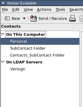
> It seems we need some better visual cue for which component is active.
> We have the toggle buttons, but this isn't where the eye is drawn when
> looking at the sidebar, particularly if you have few folders and a tall
> window. Since all components have an "On This Computer" group at the
> top, it's even more confusing.
>
> Sooo, I propose we put back something like the gray title bar, only not
> showing the currently selected folder - just showing the currently
> active component. And limit it to just the sidebar area.
>
> Here's an example:
>
> http://www.hungry.com/~toshok/images/upper-visual-cue.png
>
> We should have the component's icon up there as well, and of course it
> should be layed out a bit better, and probably be slightly larger text
> to differentiate it from the text in the source selector, etc.
>
> thoughts?
>
it looks pretty nice to me, if we include the icon next to the text.
cheers
[
Date Prev][
Date Next] [
Thread Prev][
Thread Next]
[
Thread Index]
[
Date Index]
[
Author Index]
