Re: GNOME Style Guide
- From: aday gnome org
- To: So Yeon Jeong <sjeong18 gmail com>
- Cc: Elle O <elleoltman gmail com>, engagement-list gnome org
- Subject: Re: GNOME Style Guide
- Date: Wed, 05 Apr 2017 09:45:15 +0100
So Yeon Jeong <sjeong18 gmail com> wrote:
...
Thanks for the feedback to my comments. It's good to know things aren't finalized - I realized I'm just jumping in the process.
It's great to have your input!
I'm happy to explore some more secondary colors, and I previously made an attachment trying out different visual motif colors, but am not sure if you saw it. I'm attaching it to this email again. I realize that the reason I prefer the visual motifs within a shape is because it works as a pattern more than a random addition.
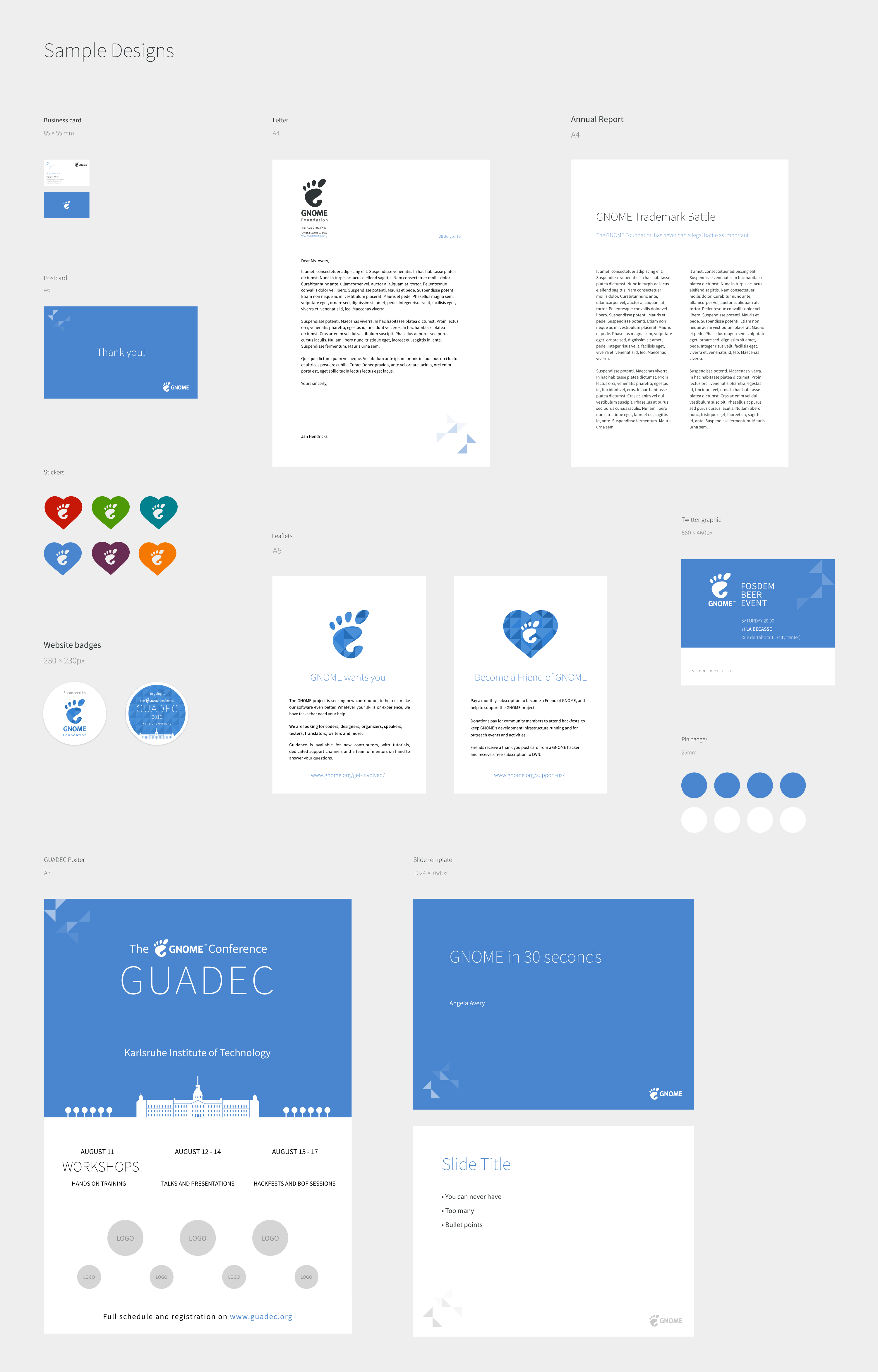
We certainly need to better define how the motifs should be used, and there is some inconsistency: in the examples, the triangles are being used in a couple of different ways. I think that they're more successful when used as a repeating background, as in the website badges [1].
Your designs look good. I think the main thing is how they will perform in practice. There are a few sets of example designs in the marketing repository, such as the one that I linked to below. Would you be able to do a couple of examples, to show how they might look? SVGs are available [2].
Allan
[
Date Prev][
Date Next] [
Thread Prev][
Thread Next]
[
Thread Index]
[
Date Index]
[
Author Index]
