Re: 2.16 slogan and banner
- From: "Panos Laganakos" <panos laganakos gmail com>
- To: "Quim Gil" <qgil desdeamericaconamor org>
- Cc: marketing-list gnome org
- Subject: Re: 2.16 slogan and banner
- Date: Mon, 28 Aug 2006 14:09:05 +0300
And we're at 07 already :)
http://panos.solhost.org/mockups/gnome-banner-07.png

On 8/28/06, Quim Gil <qgil desdeamericaconamor org> wrote:
El dl 28 de 08 del 2006 a les 10:50 +0100, en/na Joachim Noreiko va
escriure:
> The power manager icon at the front works well.
Indeed, it looks very "powerful".
A shameless proposal of elements positioning attached. Don't take
anything literal (dimensions, colors, fonts, positioning of the icons in
the orbit, etc), it's just a suggestion to relocate elements.
It also incorporates a known relation between slogan (big and important
at the top) and brand (small but also important for having a logo and
being in the "label" corner).
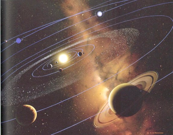
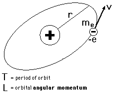
PS: Inspiration for the inclination ;)
http://artfiles.art.com/images/-/Na/Andromeda-Galaxy-Print-Print-C10091867.jpeg
http://universe-review.ca/I07-02-SolarSystem.jpg
http://hyperphysics.phy-astr.gsu.edu/Hbase/quantum/imgqua/omag1.gif
--
Quim Gil /// http://desdeamericaconamor.org | http://guadec.org
--
Panos Laganakos
[
Date Prev][
Date Next] [
Thread Prev][
Thread Next]
[
Thread Index]
[
Date Index]
[
Author Index]
